For the Philadelphia Flyers, seeing their strong, simple wing in bright orange and classic black brings gritty hockey, tough competition, and a loud, passionate fan group to mind. What keeps this famous design, introduced in 1967, so powerful and primarily unchanged? It’s more than just a nice image; it’s an example of logo design that highlights key factors for success, …

The Best NHL Logos in History
Regarding sports logos, the NHL takes the cake for providing maximum exposure. Unlike other major leagues, whose logos are often relegated to less visible positions on their uniforms or fields, hockey logos remain prominently displayed. And let’s face it – they deserve that prime spot! Each team’s logo is a carefully crafted representation of their city or region, serving as …
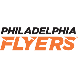
Philadelphia Flyers Logo History – Wordmark Logo
The Philadelphia Flyers logo shines in the team’s wordmark logo collection, evolving since 1967 in the NHL. Its sleek text reflects Pennsylvania’s bold spirit. Therefore, the Philadelphia Flyers logo history captivates collectors. Moreover, the Philadelphia Flyers hockey emblem showcases vibrant identity and regional pride. Philadelphia Flyers 2000 – Present A black P-Wing with an orange circle in the middle. The …

Philadelphia Flyers Logo History – Alternate Logo
The Philadelphia Flyers logo shines in the team’s alternate logo collection, evolving since 1967 in the NHL. Its bold winged “P” reflects Pennsylvania’s fierce spirit. Therefore, the Philadelphia Flyers logo history captivates collectors. Moreover, the Philadelphia Flyers hockey team’s emblem showcases vibrant identity and regional pride. Philadelphia Flyers 2000 – Present A black P-Wing with an orange circle in the …
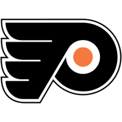
Philadelphia Flyers Logo History – Primary Logo
The Philadelphia Flyers primary logo collection showcases the team’s bold NHL history. With fierce winged-P designs, the Philadelphia Flyers logo ignites team spirit. This collection explores Philadelphia Flyers hockey legacy, connecting fans to the vibrant history and Philadelphia Flyers logo history. Philadelphia Flyers 2000 – Present A black P-Wing with an orange circle in the middle. The Flyers classic orange …