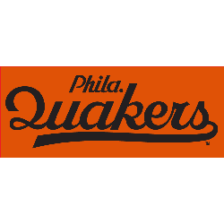
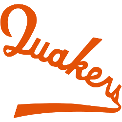
The Philadelphia Quakers logo shines in the team’s wordmark logo collection, debuting in 1930 in the NHL. Its sleek text reflects Pennsylvania’s proud spirit. Therefore, the Philadelphia Quakers history captivates collectors. Moreover, the Philadelphia Quakers NHL emblem showcases vibrant identity and regional pride.Philadelphia Quakers 1930 – 1931 A wordmark “Quakers” scripted and with a tail in orange slanted down left …
St. Louis Eagles Logo History – Alternate Logo
The St. Louis Eagles logo shines in the team’s alternate logo collection, debuting in the NHL in 1934. Its bold star design reflects Missouri’s proud spirit. Therefore, the St. Louis Eagles NHL team captivates collectors. Moreover, the St. Louis Eagles hockey emblem showcases vibrant identity and regional pride.St. Louis Eagles 1934 – 1935 A arched wordmark “ST. LOUIS” in red …
St. Louis Eagles Logo History – Primary Logo
The St. Louis Eagles logo leads the team’s primary logo collection, shining in the NHL during the 1934-35 season. Its bold design reflects Missouri’s proud heritage. Therefore, the St. Louis Eagles hockey team’s emblem draws fans, showcasing the St. Louis Eagles logo’s historic depth and regional pride.St. Louis Eagles 1934 – 1935 An arched wordmark “ST. LOUIS” in red with …
Ottawa Senators Logo History (Eagles) – Primary Logo
The Ottawa Senators logo fronts the team’s primary logo collection, shining in the NHL from 1917 to 1934. Its bold design reflects Ontario’s proud heritage. Therefore, the Ottawa Senators hockey team’s emblem draws fans, showcasing the Ottawa Senators logo history and regional pride before becoming the St. Louis Eagles.Ottawa Senators 1910 – 1933 A letter “O” in black with white …
Philadelphia Quakers Logo History – Primary Logo
The Philadelphia Quakers logo fronts the team’s primary logo collection, shining in the NHL during the 1930-31 season. Its bold design reflects Pennsylvania’s Quaker heritage. Therefore, the Philadelphia Quakers hockey team’s emblem draws fans, showcasing the Philadelphia Quakers logo’s historic depth and regional pride. Philadelphia Quakers 1930 – 1931 A wordmark “Quakers” scripted and with a tail in orange slanted …
Pittsburgh Pirates Hockey Logo – Primary Logo
The Pittsburgh Pirates hockey logo fronts the team’s primary logo collection, shining in the NHL from 1925 to 1930. Its bold design reflects Pittsburgh’s gritty spirit. Therefore, the Pittsburgh Pirates hockey team’s emblem draws fans, showcasing the Pittsburgh Pirates hockey logo’s historic depth and regional pride.Pittsburgh Pirates 1928 – 1929 A black, white, red, and yellow pirate’s head inside a …
Brooklyn Americans Logo History – Wordmark Logo
The Brooklyn Americans logo shines in the team’s wordmark logo collection, debuting in 1941 in the NHL. Its sleek text reflects New York’s bold spirit. Therefore, the Brooklyn Americans NHL legacy captivates collectors. Moreover, the Brooklyn Americans hockey emblem showcases vibrant identity and regional pride.Brooklyn Americans 1942 A Diagonal wordmark “BROOKLYN AMERICANS” is in white on a red, white, and …
Atlanta Thrashers Logo History – Wordmark Logo
The Atlanta Thrashers logo shines in the team’s wordmark logo collection, debuting in 1999 in the NHL. Its sleek text reflects Georgia’s bold spirit. Therefore, the Atlanta Thrashers history captivates collectors. Moreover, the Atlanta Thrashers symbol showcases vibrant identity and regional pride.Atlanta Thrashers 2000 – 2011 The original Thrashers logo featured a brown thrasher, who is actually Georgia’s state bird. …
Kansas City Scouts Logo History – Alternate Logo
The Kansas City Scouts logo shines in the team’s alternate logo collection, debuting in the NHL in 1974. Its bold scout design reflects Missouri’s proud spirit. Therefore, the Kansas City Scouts logo history captivates collectors. Moreover, the Kansas City Scouts NHL team’s emblem showcases vibrant identity and regional pride.Kansas City Scouts 1875 – 1976 The Scout statue that overlooks the …
Colorado Rockies Logo History (Devils) – Wordmark Logo
The Colorado Rockies logo shines in the team’s wordmark logo collection, evolving since 1976 in the NHL. Its sleek text reflects Colorado’s rugged spirit. Therefore, the Colorado Rockies hockey team captivates collectors. Moreover, the Colorado Rockies NHL logo showcases vibrant identity and regional pride.Colorado Rockies 1977 – 1982 The Scouts became the Rockies, named after the mountainous region. The logo …


