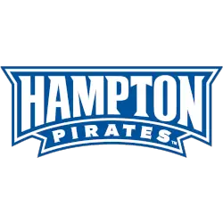
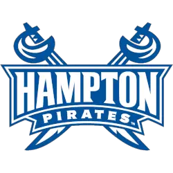
Pirates Wordmark Logo The Shreveport Pirates were a professional Canadian Football League (CFL) team that played in the city of Shreveport, Louisiana from 1994 to 1995. During their short tenure, they had an iconic logo and wordmark that is still remembered by many fans today. The logo was designed by renowned graphic artist Mark Anderson and featured a pirate wearing …
Shreveport Pirates Alternate Logo
Pirates Alternate Logo The Shreveport Pirates were a professional Canadian Football League (CFL) team that played in the city of Shreveport, Louisiana from 1994 to 1995. During their brief tenure, they developed an alternate logo that has become one of the most iconic designs in CFL history. The original design was created by artist and designer Chris Smith who had …
Shreveport Pirates Primary Logo
Pirates Primary Logo The Shreveport Pirates were a professional Canadian Football League (CFL) team that played in the city of Shreveport, Louisiana from 1994 to 1995. The Pirates are remembered for their unique logo and colors which featured a skull wearing an eye patch with crossed swords behind it. This iconic logo has become synonymous with the short-lived franchise and …
Seton Hall Pirates Wordmark Logo
Pirates Wordmark Logo The Seton Hall Pirates wordmark logo is one of the most recognizable logos in college athletics. It has been around since 1969 and has gone through many minor changes over the years, but it still maintains its original look and feel. The logo features a pirate skull with crossed swords underneath and the words “Seton Hall” written …
Seton Hall Pirates Alternate Logo
Pirates Alternate Logo The Seton Hall Pirates have a long and storied history with their logo. The original design was created in the late 1950s when the school’s athletic program was just beginning to take shape. It featured a pirate ship sailing across an ocean of blue, which has since become iconic for the university. Over time, there have been …
Seton Hall Pirates Primary Logo
Pirates Primary Logo The Seton Hall Pirates have a long and proud history. Their primary logo is one of the most recognizable symbols in college athletics, representing the school’s commitment to excellence and tradition. The original logo was introduced in 1933, featuring a pirate with crossed swords behind him. This design has remained relatively unchanged over the years, although there …
East Carolina Pirates Wordmark Logo
Pirates Wordmark Logo The East Carolina Pirates have a proud and storied history, dating back to their origins in the early 20th century. The iconic logo of the Pirates has been featured on everything from jerseys to hats for over 100 years and is one of the most recognizable logos in college sports. The original logo was created by former …
East Carolina Pirates Alternate Logo
Pirates Alternate Logo The East Carolina Pirates have a long and varied history of alternate logos. From their original logo in the late 1960s to the current design, there has been quite a bit of evolution over time. The first logo was designed by artist Robert Lipscomb and featured an old-fashioned pirate with crossed swords, which became known as “Old …
East Carolina Pirates Primary Logo
Pirates Primary Logo The East Carolina Pirates’ primary logo is an iconic symbol of the university and its athletic programs. It has gone through many iterations over the years but still retains its original look and feel. The current version features a skull-and-crossbones design with a pirate ship in the background, surrounded by two crossed swords. This logo was first …
Pittsburgh Pirates (Hockey) Wordmark Logo
Pirates Wordmark Logo The NHL Pittsburgh Pirates have a long and storied history. Their iconic wordmark logo has been an integral part of their identity since the team’s inception in 1925. The original logo featured a white letter “P” with two hockey sticks crossed underneath it, creating the impression of a pirate flag with crossed swords. This design was used …
- Page 1 of 2
- 1
- 2