The history of Major League Soccer (MLS) is not the history of its franchises, matches, or championships; it is the complex visual catalog of the transformation of the USA’s sporting culture. It talks about the transformation from the disorderly, boisterous experimentation of the 1990s to the sleek, business-minimalism of the digital era. No franchise has undergone this transformation more intensely …

San Diego FC Logo History – Wordmark Logo
The San Diego FC wordmark logo represents the vibrant energy and coastal beauty of Southern California. Since its 2023 reveal, the San Diego FC logo history has focused on a unique “Chrome and Azure” look. This design captures the professional San Diego FC logo meaning for every new fan. San Diego FC 2024 – Present The club’s official colors were …

San Diego FC Logo History – Alternate Logo
The San Diego FC alternate logo serves as a modern representation of a city defined by innovation and a coastal lifestyle. Although the club is a recent addition to the league, the San Diego FC logo history is already rich with deep cultural symbolism. Whether you are curious about the San Diego FC logo meaning or its visual growth, we …
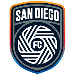
San Diego FC Logo History – Primary Logo Evolution
The San Diego FC primary logo represents a bold new chapter for Southern California soccer. As fans explore the San Diego FC logo history, they discover a design rooted in community and innovation. Understanding the San Diego FC logo meaning reveals why this emblem has quickly become a standout in the MLS landscape. San Diego FC 2024 – Present The …

Columbus Crew Logo History – Primary Logo
Dive into the captivating world of the Columbus Crew primary logo. This page showcases every primary emblem from the team’s inception in 1996 to the present day. Whether you’re curious about the old Columbus Crew logo or the full Columbus Crew logo history, you’ll find detailed insights here. These logos reflect the club’s journey, blending tradition with modern flair. Columbus …
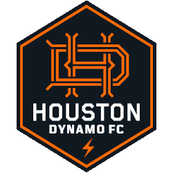
Houston Dynamo FC Logo History – Primary Logo
The Houston Dynamo FC logo history showcases the club’s branding evolution from early designs to the modern Houston Dynamo FC primary logo. The emblem represents energy and passion in Major League Soccer. Our archive provides Houston Dynamo FC logo PNG assets and historical references for detailed branding exploration. Houston Dynamo FC 2021 – Present An orange design element of the …
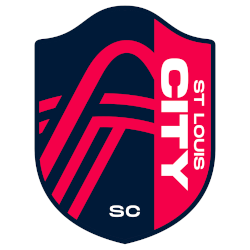
St. Louis City SC Logo History – Primary Logo
The St. Louis City SC primary logo represents a vibrant new era for soccer in America’s first soccer capital. Since the club’s 2019 founding, this emblem has captured the city’s unique spirit and geography. Whether you seek a high-quality St. Louis City SC logo PNG or want to explore the St. Louis City SC logo history, we have the details. …
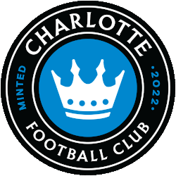
Charlotte FC Logo History – Primary Logo Evolution
The Charlotte FC logo history represents the identity and ambitions of the club since its arrival in Major League Soccer. The Charlotte FC primary logo blends local symbolism with modern soccer branding, while the availability of Charlotte FC logo PNG assets allows consistent representation across digital and print media. Charlotte FC 2022 – Present A roundel logo with wordmark “CHARLOTTE …

New York/New Jersey MetroStars Alternate Logo
MetroStars Alternate Logo The New York/New Jersey MetroStars have a long and storied history when it comes to their alternate logos. The team was founded in 1996 as one of the original ten teams in Major League Soccer, and they have had several different alternate logos over the years. One of their most popular designs is known as “the Metros” …

Chivas USA Alternate Logo
Chivas USA Alternate Logo Chivas USA is an American professional soccer team based in Los Angeles, California. The club was founded in 2004 as a Major League Soccer (MLS) expansion franchise and has been playing since 2005. Throughout its history, the team has had several alternate logos that have been used for special occasions or to commemorate important events. The …