The Houston Dynamo Football Club has a brand new look and a brand new identity. The Dynamo rolled out a brand new logo not only for their football club but also their women’s football club called the Houston Dash. The only thing that is similar to the logos is the colors from the old to the new. The new logo …
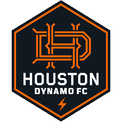
Houston Dynamo FC Logo History – Primary Logo
The Houston Dynamo FC logo history showcases the club’s branding evolution from early designs to the modern Houston Dynamo FC primary logo. The emblem represents energy and passion in Major League Soccer. Our archive provides Houston Dynamo FC logo PNG assets and historical references for detailed branding exploration. Houston Dynamo FC 2021 – Present An orange design element of the …
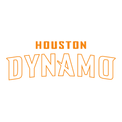
Houston Dynamo Logo History – Wordmark Logo
The Houston Dynamo logo history represents the powerful spirit of Texas soccer. Our gallery tracks the evolution of the Houston Dynamo wordmark logo, from the 2006 inaugural season to the modern era. Consequently, you can explore every Houston Dynamo logo PNG to see how the team’s typography reflected the city’s energy.Houston Dynamo 2006 – 2020 A black shield with white …

Houston Dynamo Logo History – Primary Logo
The Houston Dynamo primary logo represents the industrial energy and the “Space City” spirit of a two-time MLS Cup champion. Since 2006, the Houston Dynamo logo history has evolved from an ad-hoc starburst to a sleek, modern hexagonal crest. Find every Houston Dynamo logo PNG in our complete club archive. Dynamo Wordmark LogoDynamo Team History Thank you for visiting Sports …