This page documents the complete Maryland Eastern Shore Hawks logo history with a focus on official primary designs. Each Maryland Eastern Shore Hawks primary logo reflects the team’s visual identity. Moreover, these Eastern Shore Hawks logo PNG primary logos are presented from the program’s early years through the present day. Maryland Eastern Shore Hawks 2022 – Present A full-body hawk …
Monmouth Hawks Logo History – Primary Logo
The Monmouth Hawks logo history highlights how the program built its identity through primary designs. This page showcases every Monmouth Hawks Primary logo from start to present day. Each Monmouth football logo reflects updates in style, color balance, and hawk symbolism across different eras. Monmouth Hawks 2014 – Present A wordmark “MONMOUTH” in white on a blue background in front …
St. Joseph’s Hawks Logo History – Primary Logo
The St. Joseph’s Hawks logo history showcases the evolution of the team’s primary logos over the years. Fans can view each St. Joseph’s Hawks Primary logo from early designs to the modern version. This page also includes St. Joseph Hawks basketball logos, offering a complete view of the team’s visual identity from the start to present in a clear and …
Milwaukee Hawks Logo History – Primary Logo
Take flight with the Milwaukee Hawks logo and its storied past. From its short-lived Milwaukee days to the Bucks’ legacy, we explore the Milwaukee Bucks logo history, share Milwaukee logo png files, and highlight the Milwaukee Bucks logo basketball, celebrating the team’s bold spirit for every fan.Milwaukee Hawks 1954 – 1955 For what would ultimately prove to be their last …
St. Louis Hawks Logo History – Primary Logo
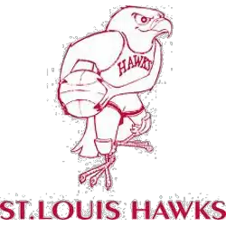
Soar into the legacy of the St. Louis Hawks logo and its timeless tale. From classic designs to bold emblems, we unpack the St. Louis Hawks history, share St. Louis Hawks NBA details, and spotlight the Hawks symbol, celebrating the team’s proud spirit for every Hawks fan.St. Louis Hawks 1958 – 1968 In 1957 the Hawks introduced this Disney-looking cartoon …
Atlanta Hawks Logo History – Primary Logo
The Atlanta Hawks logo has changed multiple times, reflecting different eras in the team’s journey. From its earliest days to its modern design, each version of the primary logo holds meaning. Whether you’re a collector or fan, this page presents the complete Atlanta Hawks logo history, including the old Atlanta Hawks logo and high-quality Atlanta Hawks logo PNGs. Atlanta Hawks …

