
Alabama A&M Bulldogs
Front-facing bulldog's head with a shadow, bent ears, and a collar with initials "AAMU" in maroon and white. A former alternate logo. New shade of maroon.
Alabama State Hornets
A hornet is between the letter U of the initials "ASU" in black.
Alcorn State Braves
A purple letter "A" with gold trim and a wordmark "ALCORN" written in the middle of the letter "A" in gold with highlights.

Arkansas-PB Golden Lions
Right-facing golden lion's head with its mane forming the initials "UAPB," in gold, black, and red.
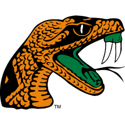
Florida A&M Rattlers
The head of a rattler is orange, green, black, and white with fangs out.
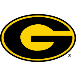
Grambling State Tigers
Black letter "G" inside yellow in a oval shape with black trim.

Jackson State Tigers
A large letter "J" in white next to the letters "S" and "U" stacked in white all on a blue background.

Mississippi Valley State Delta Devils
A Devil holding a flame in green, red, and black with the wordmark "DELTA" wordmark "DELTA" in green and the script "Devils" in red on a white background.
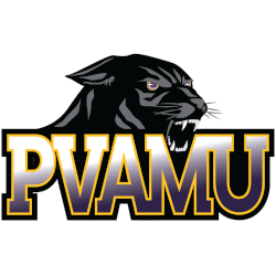
Prairie View A&M Panthers
A black growling panther's head above the initials "PVAMU" in a gradient from white to purple with gold trim.

Southern Jaguars
Initials "SU" in white with yellow highlights on a light blue background.

Texas Southern Tigers
Initials "TSU" with a tiger head appearing from the right side of the letter "T" all on the state of Texas in maroon, white, and gray.
Southwestern Athletic Conference Logo History
The Southwestern Athletic Conference logo is crafted to communicate strength, stability, and institutional pride. Its structured typography and balanced composition make the SWAC logo instantly recognizable across broadcasts, apparel, and digital platforms. Over the years, careful refinements have enhanced visibility and scalability without sacrificing the character that southwest conference teams associate with the brand.
As collegiate athletics modernized, the conference preserved a cohesive look that supports member institutions while allowing individual branding to thrive. This consistency has helped southwest conference teams benefit from a unified visual presence that reinforces credibility and tradition.
To better understand the conference’s origins and development, visit the official history page. You can also explore design variations by viewing the Southwestern Athletic Conference Alternate Logo page to see how secondary marks complement the primary identity.
Design Evolution and Legacy
The longevity of the Southwestern Athletic Conference logo stems from its strategic simplicity and authoritative design. Rather than following short-term trends, the conference prioritized clarity and professionalism—qualities that resonate strongly with southwest conference teams competing on a national stage.
Today, the SWAC logo represents more than a visual mark; it symbolizes heritage, athletic achievement, and conference unity. Reviewing each primary logo in chronological order reveals how thoughtful updates preserved tradition while positioning the conference for continued relevance in collegiate athletics.