Norwich City FC
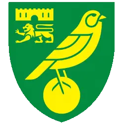
In 2022, Norwich simplified the previous design and features a redesigned lion, castle, and canary, all of which have been redrawn from scratch.

Norwich City FC
1972 - 2022
In 1972, the Canaries won the Second Division title and took their place in the First Division for the first time. To mark this achievement a new crest was designed, which included a lion and castle from the city's coat of arms. The Canary and football is now yellow with black highlights on a green with black trim shield.

Norwich City FC
1940 - 1972
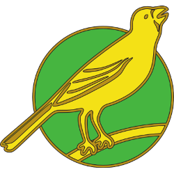
The Norwich badge from the '40s is just the essentials − a canary standing on a football (without the seams), and the castle and lion of the City of Norwich in the upper right corner on a green with gold trim shield.
Norwich City FC
1922 - 1940
Norwich City finally presented a canary logo, which was worn by the players for years. A yellow with gold highlights carney standing on a yellow with gold trim stick with a green with gold trim background circle.
Norwich City FC
1902 - 1922
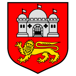
The original Norwich City crest was the arms of the City, a silver castle and a gold lion on a red with black trim shield. But the club was known as the Canaries and where, the fans asked, was the bird?
Norwich City FC Logo History
The Norwich City FC logo history officially took a major turn in 1907 when the club adopted the "Canaries" nickname. Before this, the team was known as the Citizens, but the introduction of a bird on the crest changed their identity forever. The most iconic version of the Norwich City football club logo features a canary perched upon a football, accompanied by the castle and lion from the city’s coat of arms. Therefore, the Norwich City FC logo perfectly balances the club's sporting spirit with its local heritage. This design remained largely consistent for decades, becoming a staple of the top flight.
In 2022, the club launched a significantly refreshed Norwich City FC logo to better suit the digital age. This modern iteration of the Norwich City football club logo simplified the details of the lion and the castle while giving the canary a bolder, cleaner silhouette. You can visit our Ipswich Town FC logo page to see how their East Anglian rivals have also evolved their branding over time. By updating the Norwich City FC logo, the club ensured that its brand remains sharp on television screens and mobile devices worldwide. Furthermore, the removal of black outlines created a more cohesive "Green and Yellow" look.
The Norwich City FC logo continues to represent a community-focused club with a rich top-flight pedigree. You can visit the STH Norwich City FC team history page to learn more about their famous victories at Carrow Road. We maintain a detailed record of the Norwich City FC logo history to document every artistic shift for the fans. Every version of the Norwich City football club logo captures a specific era of passion and resilience. Ultimately, the canary remains a beloved icon that unites supporters across the globe under the famous yellow and green banner.
Soccer Sports Fan Products


Norwich City FC Fans, Time to Make Your Mark!
Get ready for the Premier League Team Logo Battle as the Norwich City F.C. logo goes head-to-head with rival team crests. The Norwich City FC primary logo features the iconic canary perched on a football within a classic shield, symbolizing the club’s heritage and proud identity. Inspired by the traditions of Norwich, the emblem reflects determination, unity, and competitive spirit.
More than a visual mark, the Norwich City FC logo represents loyalty, resilience, and pride among supporters. Fans proudly rally behind this historic crest as it enters the ultimate team logo battle. With its distinctive canary symbol and bold yellow and green colors, the Norwich City emblem captures the passion, tradition, and determination that define the club and its devoted fan base.