College Sports Fan Products
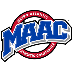
MAAC Logo Battle
The Metro Atlantic Athletic Conference (MAAC) is a highly competitive conference of 11 Division I schools in the Northeastern United States. Each school has its unique logo that represents its identity and brand. However, with so many teams competing for attention, the battle for the best logo in the MAAC is fierce. In this essay, we will explore the logos of three MAAC teams and analyze their design elements, symbolism, and overall impact.
One of the most iconic logos in the MAAC belongs to the Iona College Gaels. The logo features a fierce Gaelic warrior with a shield and sword, representing the school's Irish heritage and solid athletic spirit. Using bold colors and sharp lines gives the logo a powerful and intimidating look, making it stand out among other MAAC logos. Additionally, Gael's stance and facial expression exude confidence and determination, perfectly capturing the competitive nature of the MAAC.
Another team with a strong logo is the Rider University Broncs. The logo features a charging horse with its mane flowing behind it, symbolizing strength, speed, and determination. The use of the school's maroon and white colors adds a sense of unity and pride to the logo. The Broncs' logo is visually appealing and represents the school's athletic philosophy of never giving up and always striving for success.
In conclusion, the battle for the best logo in the MAAC is intense, with each team striving to create a logo that represents their identity and values. The Iona College Gaels and Rider University Broncs are just two examples of the many impressive logos used at the conference. These logos serve as symbols of the teams and unite and inspire their fans, making them an essential aspect of the MAAC's competitive spirit.


