Rams and Chargers Relocation Logos

Contrasting Fortunes: The Rams and Chargers Since Relocating to Los Angeles and Updating Their Logos

Picture the fourth quarter of Super Bowl LVI, February 2022. SoFi Stadium — their stadium, in their city — shaking as Cooper Kupp hauls in the go-ahead touchdown against the Cincinnati Bengals with 1:25 left on the clock. A franchise once written off as St. Louis’ problem, mocked on arrival in Tinseltown, scorned for leaving one fanbase without securing another …


Fan Favorites NFL Logos

Fan Favorites: The Most Beloved NFL Throwback Logos in Sports History

Some NFL logos do more than identify a team. They pull people back into a specific kind of Sunday. The old jacket. The heavy helmet. The broadcast graphics. The feeling that every team had a stranger, bolder, more handmade visual identity. That is why throwback logos still matter. They are not just old designs. They are emotional shorthand. A single …

Cap to Crown

From Cap to Crown: The Evolution of MLB Team Logos and the Players Who Made Them Iconic

A baseball cap is one of the most distinctive pieces of visual design in American sports. The interlocking NY of the Yankees, the swinging A of the Athletics, the Old English D of the Tigers, these marks have outlasted players, managers, owners, and even cities. They carry the weight of eras, serving simultaneously as civic symbols, fashion artifacts, and shorthand …

Beyond the Wordmark: The Ultimate Guide to Identifying All 32 NFL Logos Without Names

Beyond the Wordmark: The Ultimate Guide to Identifying All 32 NFL Logos Without Names

Beyond the Wordmark: The Ultimate Guide to Identifying All 32 NFL Logos Without Names Strip away the lettering. Remove every wordmark. What’s left? For the most devoted fans, absolutely everything they need. The ability to recognize NFL logos without names is a genuine test of fandom — and it reveals something profound about how professional sports branding actually works. “Symbolic …

Neo Mini vs Heritage 3

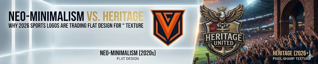
Neo-Minimalism vs. Heritage: Why 2026 Sports Logos Are Trading Flat Design for ‘Pixel-Sharp’ Texture

For the best part of a decade, the dominant grammar of sports logo design was silence. Clubs flattened their crests, stripped embossing from their badges, and deleted the shadows that gave their shields a sense of weight. The lion became an outline. The crest became a glyph. The colours became brand tokens. It was a logical response to the digital …

NBA Fan Favorites

NBA Fan Favorites: The Most Beloved Throwback Logos in Sports History and the Game Today

Every sports lover knows the instant burst of memories that comes from seeing a classic emblem. From city skylines stitched onto jerseys to cartoon mascots soaring across center court, old-school graphics make fans smile before the opening tip. Even casinos eager to stand out in a crowded market study these brilliant designs; in fact, many casinos around the globe examine …

NFL Relocation City Logos

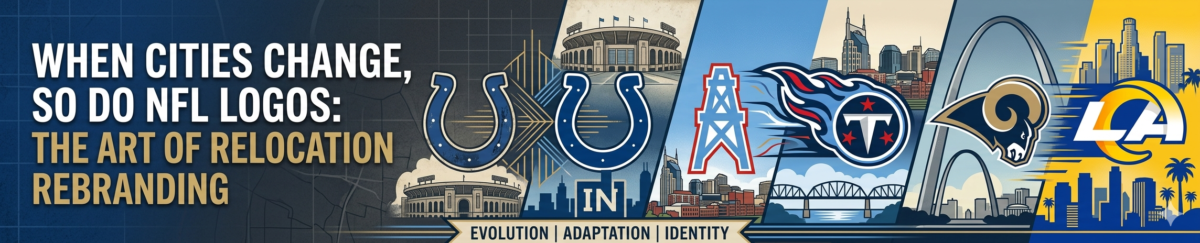
When Cities Change, so do NFL Logos: The Art of Relocation Rebranding

The sports franchise system popularized in the major North American leagues is often maligned for focusing on commercial interests rather than on-field competition. One of the biggest bugbears for fans is team relocation, where owners abandon an existing fanbase in favor of laying down roots in a different city. There have been several recent examples in the National Football League …