

Calgary Stampeders
Double lined wordmark "CALGARY" in red on top and "Stampeders" in black on the bottom.
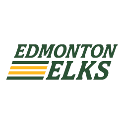
Edmonton Elks
A double-lined wordmark "EDMONTON ELKS" in green with four lines in both green and gold.
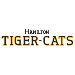
Hamilton Tiger-Cats
Wordmark "HAMILTON' on top in black and "TIGER-CATS" on bottom in black with yellow trim.

Montreal Alouettes
Wordmark "Montreals," in a combination of Montreal in white with blue trim and "als" in blue.

Ottawa Redblacks
Wordmark "OTTAWA" in black on the top, "RED" in red and "BLACKS" in black.

Winnipeg Blue Bombers
A blue with gold trim letter "W" next to wordmark "WINNIPEG BLUE BOMBERS" in blue with gold trim.
CFL Wordmark Logo History
The CFL wordmark logo has played a central role in establishing consistency across Canadian Football League teams. Early designs focused on bold block lettering that emphasized clarity and recognition. As the CFL logo history progressed, wordmarks adopted cleaner lines and balanced spacing to reflect modern sports branding standards.
Several updates within the CFL logo history introduced refined typography and simplified color treatments. These adjustments strengthened digital visibility and merchandise appeal. Each archived CFL wordmark logo demonstrates how Canadian Football League teams maintained strong brand alignment while adapting to contemporary graphic design practices.
Today, this collection preserves every documented CFL wordmark logo used throughout the CFL logo history. The structured timeline allows visitors to track typographic development across Canadian Football League teams from inception to present day. To explore individual franchise backgrounds, visit each team’s official History page. You can also review each team’s Primary Logo page to compare symbol-based branding elements.
Football Sports Fan Products