WNBA Logo – Primary Logos of All WNBA Teams

The WNBA logo represents the dynamic spirit of women’s basketball, uniting fans with its bold design. Since its debut, the WNBA logo history has evolved, reflecting the league’s growth. Explore the vibrant primary logos of all WNBA teams, showcasing unique identities that capture each team’s essence and the league’s commitment to excellence in women’s sports.
WNBA Logo - Primary Logos of All WNBA Teams
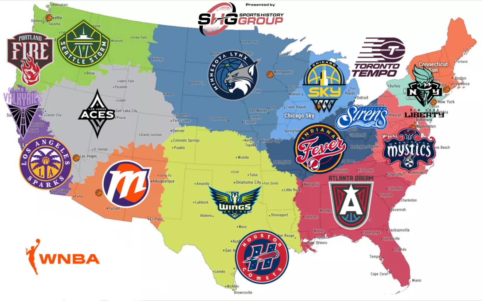
WNBA Teams Logos Map
atlanta-dream-primary-logo

Atlanta Dream

A large white letter "A" with a star at the top on a dark grey shield with a red phoenix and a blue basketball on it with a wordmark "ATLANTA DREAM" appearing above the shield in black.

See Team Logos
chicago-sky-primary-logo

Chicago Sky

The Willis Tower in yellow and white on a blue and yellow basketball with black trim, wordmark "CHICAGO" written above in white on black and "SKY" in yellow on a blue background with a black basketball net hanging below.

See Team Logos
cleveland-sirens-primary-logo

Cleveland Sirens

The Cleveland Sirens logo features "Sirens" in flowing white script across a royal blue field, with "CLEVELAND" in light blue lettering above and the whole mark contained within a light blue outline. Beneath the script, a light blue siren of Greek mythology swims horizontally with flowing hair, cradling a basketball at the wordmark's final "S," her body riding a sweeping wave along the base of the design. Per the team, the mark is constructed to represent movement, with its shapes moving "fluid, fast, always in motion" like water and basketball itself; the siren's hair carries five points, representing both the five Great Lakes and the five positions on a basketball team, while the swashes surrounding her represent sound waves, the reverberation of her call rippling outward through the mark.

See Team Logos
dallas-wings-primary-logo

Dallas Wings

Winged horse in navy, volt green and cyan and a wordmark "WINGS" in white with volt green trim and "DALLAS" in volt green with a WNBA basketball.

See Team Logos
golden-state-valkyries-primary-logo

Golden State Valkyries

A set of Valkyrie wings and the wings’ spine, down the logo’s center, two visual symbols in one. It’s shaped like a Valkyrie’s sword, “a symbol of courage, power, and authority,” according to the team. However, it also represents the Bay Bridge. This significant landmark connects Oakland, where the Valkyries’ practice facility and front office are located, to San Francisco, where the team will play its home games. Look closer, and you’ll notice its V-shaped wings have 13 lines. This refers to the fact that it’s the WNBA’s 13th team and is arranged to resemble bridge cables. Finally, above is a wordmark "GOLDEN STATE VALKYRIES" in violet.

See Team Logos
houston-comets-primary-logo

Houston Comets

The new Houston Comets logo is a circular roundel. A thick red outer ring carries “HOUSTON” across the top and “COMETS” around the bottom in white, playful block lettering. In the navy center, a bold italic “H” with a white outline is filled with small white stars, like a night sky. A red basketball streaks through the “H” as a comet, trailing white and light-blue speed lines that cut across the letter, giving the badge a sense of motion. The red, white and navy palette ties it to the franchise’s original look. The old primary logo, used from 1997 to 2008, was a red basketball forming a comet that shot over a “Comets” script on a starfield. It had no enclosing shape and was built around the script wordmark. The new logo keeps the core idea of a basketball comet and a starry sky, but changes the structure. The wordmark moves into a circular badge with “HOUSTON” and “COMETS” in block letters around the ring, and the centerpiece becomes a large star-filled “H.” The original alternate logo also had a basketball comet shooting through an “H” with starfields. So the new design effectively takes the old alternate mark as its core, wraps it in a modern roundel, and makes it the primary logo for the team’s return to Houston in 2027.

See Team Logos
indiana-fever-primary-logo

Indiana Fever

Wordmark "Fever" scripted in custom font in red with white trim on blue with yellow and red circle with background. Wordmark "INDIANA" in yellow arched near the top.

See Team Logos
las-vegas-aces-primary-logo

Las Vegas Aces

A wordmark "ACES" in white across a black diamond with the white letter "A" above it, silver initials "LV" below it, and a diamond in the middle.

See Team Logos
los-angeles-sparks-primary-logo

Los Angeles Sparks

A purple ring with gold trim with encircled wordmark "LOS ANGELES SPARKS" in white. A gold and purple circle with a purple palm tree and a gold basketball in the center. Initials “LA” at the bottom in yellow.

See Team Logos
minnesota-lynx-primary-logo

Minnesota Lynx

A blue with dark blue trim basketball and a green star representing the north star. Wordmark "MINNESOTA LYNX" in white arranged around the basketball. A sideview of Lynx's head in gray and white.

See Team Logos
new-york-liberty-primary-logo

New York Liberty

The seafoam and black basketball torch from the Statue of Liberty in a black with white and black outline shield with the initials "NY" in white, and below in a custom font a wordmark "NEW YORK LIBERTY" in black.

See Team Logos
phoenix-mercury-primary-logo

Phoenix Mercury

The iconic angled “M,” now with sharp edges instead of rounded ones, and set at a specific 19.97 degrees, which is a nod to the franchise’s inaugural season in 1997. It also features a purple crescent to emphasize the “shadowed side of planet Mercury” and convey a sense of movement, while adding color contrast.

See Team Logos
portland-fire-primary-logo

Portland Fire

An arched wordmark "PORTLAND" in grey above the wordmark "FIRE" in grey on a brown shield with red and grey trim, above the rose on fire in red with grey highlights.

See Team Logos
seattle-storm-primary-logo

Seattle Storm

The new design retains the iconic image of the Space Needle, which sits within basketball ribs and adds inspiration from Mount Rainier for its shape. At the center, a lightning bolt evokes the intensity, power, and purpose of the Storm identity both on and off the court. The typeface of the wordmark “SEATTLE STORM” on the new logo features a thinner custom font.

See Team Logos
toronto-tempo-primary-logo

Toronto Tempo

The letter "T" is in maroon within a maroon basketball, six charging speed lines are on the left side, and a wordmark is "TORONTO TEMPO" in maroon. The six lines symbolize the five players on the court and the fans while paying homage to Toronto's nickname, "The Six."

See Team Logos
washington-mystics-primary-logo

Washington Mystics

Wordmark "MYSTICS" in white with red trim with hoop and a WNBA basketball on a psychedelic dark blue, gray and red wavy banner.

See Team Logos

"The Torch Has Been Passed. The Legacy Continues"

From the pioneers who started it all to the generational talents of today, the WNBA is making history every night. Represent the movement and wear the colors of the women who are changing the game forever.

Shop the Official WNBA Collection

WNBA Logo Collection

The WNBA logo is a symbol of empowerment, reflecting the league’s legacy since 1997. Each of the 12 WNBA teams’ logos tells a unique story, blending style and strength. From the Atlanta Dream to the Seattle Storm, these designs captivate fans. Learn more about team rosters on the WNBA teams Wikipedia page. Dive into the artistry of WNBA team logos today!

WNBA team logos are more than designs; they embody team pride and fan loyalty. All WNBA teams have crafted iconic primary logos that resonate with their cities and histories. For example, the Las Vegas Aces’ logo shines with bold flair. Check out the
Las Vegas Aces alternate logo for a closer look. These logos unite fans and celebrate the WNBA’s vibrant legacy in women’s basketball.