Oklahoma Outlaws
1983 - 1984
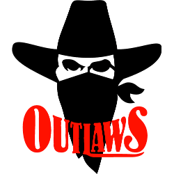
Cowboy face with a bandana covering part of his face and a wordmark "OUTLAWS" in red.
Outlaws Logo History
The Oklahoma Outlaws have a long and storied history in the United States Football League (USFL). From 1983 to 1985, they were one of the most successful teams in the league, making three consecutive playoff appearances and winning two division titles. As such, their logo has become an iconic symbol of USFL football.
The original logo for the team was designed by artist Robert Lago in 1982. It featured a red-and-black shield with an orange outline that contained two crossed tomahawks inside it – symbols of strength and courage to Native Americans – as well as "OKLAHOMA OUTLAWS" written across it. This design remained unchanged until 1984 when minor adjustments were made to make way for new sponsor logos on uniforms and other merchandise items associated with the team at that time.
In 1986, after relocating from Tulsa to Orlando due to financial difficulties caused by USFL's move from spring/summer play into fall/winter competition against NFL teams, Oklahoma Outlaws unveiled a completely redesigned logo featuring a white horse head silhouette set against an orange background surrounded by black flames coming out from behind its mane; this image was meant to evoke feelings of power while remaining true enough visually so fans could still recognize them as being part of their beloved franchise despite all changes undergone during those tumultuous times. The words “Oklahoma Outlaws” remain underneath this new design but now appear much smaller than before so they don't take attention away from the main element itself "the horse head."
Despite only playing three seasons under these colors before folding along with the rest league’s members at the end 1985 season, the Oklahoma outlaws' mark is still remembered fondly today among old fans who remember good times spent cheering on their favorite franchise back then. Even though there are no longer any active professional sports franchises bearing its name or using the same graphic elements, a legacy left behind remains a strong testament to how even short-lived organizations can leave lasting impressions if done right.
Oklahoma Outlaws
1983 - 1984
Wordmark Logo
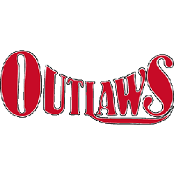
A backward arched wordmark "OUTLAWS" in red.


