Washington Redskins
1983 - 2020
A simplified, modernized form of the native American head inside a yellow circle, with two feathers attached to it. This logo is the same logo as the 1972 logo.
Washington Redskins
1972 - 2020
Wordmark "REDSKINS" in maroon.
Font: TS Napoli ExtraBold by Morris Fuller Benton & Pythagoras
https://fontmeme.com/washington-redskins-font/

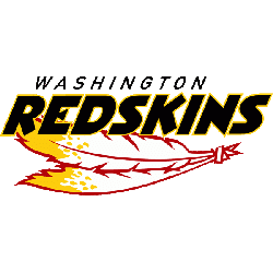
Washington Redskins
1972 - 2020
Wordmark "REDSKINS" in yellow.
Font: TS Napoli ExtraBold by Morris Fuller Benton & Pythagoras
https://fontmeme.com/washington-redskins-font/
Wordmark Identity of the Washington Redskins
The old Washington redskins logo was often paired with the bold wordmark, emphasizing tradition and team strength. Over the years, slight changes were made to letter spacing and font weight. You can see the full progression on our Washington Primary Logo page, showing how designs evolved before the rebrand.
Fans still search for the Washington redskins logo PNG to collect historic images from past seasons. These logos remain part of NFL history. For official details and historical imagery, the SportsLogos.net Redskins page has a detailed archive of past versions and logo changes.
Football Sports Fan Products