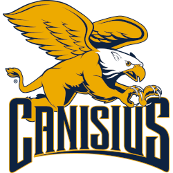
Canisius Golden Griffins
A side view of a griffin flying with claws out in gold, white and blue above a bottom arched wordmark "CANISIUS" with a arched underscore in blue with gold highlights. Removed the wordmark "COLLEGE."

Fairfield Stags
A side view of a deer's head in red, white, silver, and black is above the wordmark "FAIRFIELD" in red with black trim and "UNIVERSITY" in black.
Iona Gaels
A wordmark "IONA" in maroon with gold trim on a white above the wordmark "GAELS" in white with a Celtic knot on the shield in maroon with white and gold outline.
Manhattan Jaspers
A block letter "M" in green with a wordmark "JASPERS" in white on a green banner.
Marist Red Foxes
A red, white, grey, and black fox walks beside the initialized wordmark "MARIST" in red with white and black trim.
Merrimack Warriors
The initials "MC" are connected in blue with light blue highlights and white, gold, and blue trim.
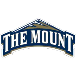
Mount St. Mary's Mountaineers
An arched wordmark, "THE MOUNT," is white with a mountain above in gold, white, and blue. A darker shade of blue.
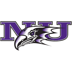
Niagara Purple Eagles
The head of an eagle is white, black, and purple, with the initials "NU" in purple, white, and black trim.

Quinnipiac Bobcats
A bobcat's head is in gold, white, and blue inside a roundel with the encircled wordmark "QUINNIPIAC" in blue surrounded by a blue outline.
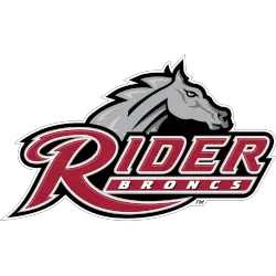
Rider Broncs
A bronc's head above the custom wordmark "RIDER" in cranberry with white trim and "BRONCS" in white on a cranberry background with white trim on a black-formed background.
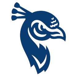
Saint Peter's Peacocks
A redesigned attitude peacock in blue and white with three crest feathers symbolized the holy trinity found on the University seal.

Sacred Heart Pioneers
The initials "SHU" in red with white highlights on a white formed background with a black and grey double trim.
Siena Saints
A St. Bernard dog's head in green, gold, and white above a wordmark "SIENA" in gold on a green-formed background.
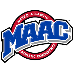
MAAC logo History
The MAAC logo serves as the foundation of conference branding for all MAAC teams. Over time, the Metro Atlantic Athletic Conference logo refined color balance, typography, and symbol clarity. As a result, the primary mark stayed recognizable across courts, uniforms, and digital platforms. More background is available on MAAC Wikipedia.
As design standards evolved, the MAAC logo focused on consistency rather than drastic change. Therefore, updates improved legibility and modern use while preserving tradition. Each version of the Metro Atlantic Athletic Conference logo reflects how MAAC teams adapted conference branding to new media needs.
While this page focuses on primary branding, alternate designs also support conference identity. For that reason, visit the MAAC Teams Alternate Logo Page to review secondary styles. Together, alternates and the MAAC logo present a complete visual record of MAAC teams branding from start to present.
College Sports Fan Products