
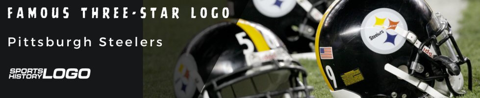
The Pittsburgh Steelers’ famous three-star logo is one of the most renowned symbols in the world of sports, for various reasons. The Steelers’ highly praised steel-type defense has proven a perfect match for the team’s name and logo. Of course, we won’t ignore how the franchise has shown tremendous strength and toughness over the decades since it won its first trophy.
However, how many fans are aware of the longevity or symbolism of the star-like logo, or its history? Let’s figure it out.
Eight Different Logos with Varying Longevities
The Pittsburgh Steelers didn’t always bear their name. Consequently, their current logo wasn’t always the franchise’s official symbol. Throughout their nearly century-long history, the Steelers have used eight different logos. However, the three stars emerged in the seventh emblem, adopted in 1969 and closely matching the recent franchise’s symbol.
The 1969 sign featured a wordmark with the name Steelers in black and three colorful stars with four spikes. The logo was eye-catching, reportedly boosted the team’s confidence, and would represent its stellar future. The seventh symbol had blue, red, and yellow stars in the middle of a grey circular frame, reminding players who love to play in fastest paying casinos about their dire need for good luck.
This design would last for over 30 years before seeing a stealth modification in 2002. The alteration was scarcely noticeable, yet it made a significant impact. It involved a bolder wordmark that enhanced the visibility of the team name. A black outline was added around the grey frame, lending an overall sense of elegance and inviting appeal to the logo.
Demystifying the Logo Design Elements
Throughout its history, every emblem used by the franchise has mirrored elements of Pittsburgh's steel industry, royal heritage, and the sport of American football. Often, these logos have proven to be relevant and resonate with the team’s spirit, goals, and style of play. Let's examine the design elements within the team's current emblem in more detail.
The Stars
Also known as hypocycloids, the three stars featured in the Steelers' emblem boast four distinct spikes. They represent diamond, a raw material used in manufacturing steel. The hypocycloids come in three bright colors: yellow, blue, and red.
 Yellow signifies coal, red signifies iron ore, while blue signifies steel crap – all vital elements used in the industry. Besides their direct relationship to the manufacturing line’s features, stars have other symbolisms, such as hope, fame, and good luck. Even more, they can also symbolize divinity, faith, and motivation.
The Circle
Everything within the logo is in a bold circle. A circle symbolizes unity and friendship. It could also signify totality, eternity, and wholeness.
The Colours
The Steelers' emblem incorporates five distinct colors, each significant to the franchise and its passionate fan base. Here's what each one symbolizes:
- Red: Red is often associated with fire and blood. It first appeared in the circular logo in 1969 and has remained in use as the franchise’s symbol of fire and energy. Undoubtedly, red is the most enlivening color in the universe. Signifying vigor, willpower, and passion, the color represents all the Pittsburgh Steelers have conveyed since 1969. Again, red also symbolizes iron ore, which is used in the steel industry.
- Blue: Besides symbolizing the steel scrap, the color blue denotes trust. It also signifies loyalty, serenity, and confidence. The globe-themed color can also represent stability, imagination, and freedom.
- Black: Black has been a prominent color in most of the Steelers’ logos. Today, the “bold Steelers” word mark is in black. The outline of the circular frame is also in black. While some associate black with mystery and fear, the dark hue can also evoke positive emotions such as formality, power, authority, and strength. The bold symbol has undoubtedly been reflected in the team’s stellar performances over the decades.
- Yellow: Yellow has featured in six of the eight Steelers’ logos. That suggests the color must be significant to the organization’s goals. Yellow represents coal, one of the principal raw materials used in steel manufacturing. It can also convey happiness, hope, energy, honor, intellect, and loyalty.
- Gray: Gray depicts a blend of white and black. It signifies intellect and compromise. The calm, elegant, and neutral colors paint the frame’s outline and reflect the personality of the Pittsburgh Steelers.
Logo Name
The Steelers logo represents the American Iron and Steel Institute’s trademark. The US steel industry uses it as its official promotional emblem. The logo has also earned the official designation “Steelmark” due to its connection to the steel manufacturing industry.
But the Steelmark has also earned other names from the sporting world. Some fans called it the “Diamond”; others, the “Asteroids.”
The Design
The US Steel industry is credited with designing the Steelers logo. But it wasn’t complete until the early ’60s when the Pittsburgh Steelers petitioned the American Iron and Steel Institute (AISI) to change the word “Steel” to “Steelers.” This adjustment required the addition of just three letters: E, R, and S.
Placement on Helmet
The Pittsburgh Steelers are uniquely distinguished in the NFL as the only franchise to feature their logo on just one side of their helmet. This occurred temporarily as the Steelers still determined how the logo would fare on an all-gold helmet.
However, the uncertainty regarding the placement of the logo would change after 1962, when the Steelers finished the year with a 9-5 record, registering their most wins at the time. They finished second in the Eastern Conference and qualified for the Playoff Bowl.
To celebrate the victory, the Steelers opted to do something special – they changed the color of their helmets from gold to black. Incidentally, this reaction would only enhance their new logo (featuring red, blue, and yellow stars) even further. But the franchise still chose to keep the logo, as they had, on only one side of the helmet. And it has never changed since then.
Wrap Up
Over seven decades after Art Rooney bought the franchise, the Pittsburgh Steelers have recorded five Super Bowl victories, 24 division titles, and eight conference titles. Steelers fans and followers worldwide have come to associate the logo with the strength of the franchise and the Steel City of Pittsburgh, where it’s located. Undoubtedly, the logo aptly describes the success of the Steelers and may even pique fans’ interest in learning about the history of similar elements or symbols in the NFL franchise.
She Didn’t Even Know the WNBA… Then Caitlin Clark Happens
Subscribe to Our YouTube Channel