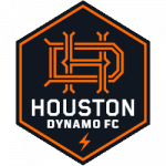
The Houston Dynamo Football Club has a brand new look and a brand new identity. The Dynamo rolled out a brand new logo not only for their football club but also their women’s football club called the Houston Dash.
The only thing that is similar to the logos is the colors from the old to the new. The new logo has a black hexagon that is trimmed in orange. The hexagon, which is six-sided, is meant to represent the six wards of Houston as well as the first year of the club, 2006. The most drastic change is the actual logo for the team itself. Houston created an overlapping letter "H" and an overlapping letter "D" for Houston Dynamo. Before the logo for the Dynamo was just a star that looked very similar to the Houston Astros.
Modern Changes
 Sports Logo History
 Houston Dynamo FC Primary Logo 2021 - Present
This new logo features a lightning bolt at the bottom of the hexagon, which seems to replace the star from the old logo. This lightning bolt represents the slogan of the city, Energy Capital of the World. The words Houston Dynamo are written in white inside the hexagon and below the logo itself.
This logo seems to modernize the football club and really bring them into the new decade in the right way. From the star to the lightning bolt, the cleanness of the logo, and the clean colors, this is a fantastic logo for a team looking for a new brand and a new identity. This is also the first time that the Dynamo has made any sort of change to their logo in team history.
Fan Reaction
Despite the logo looking very nice and looking extremely clean, it seems that many fans are not happy with the logo. This is for a couple of reasons. Fans seem to not enjoy the different aspects of the actual look and it seems that they would rather their team is more concerned about putting talent on the field rather than changing the logo of their squad.
This fan seems to think that this logo doesn’t look anything like a soccer or football logo but rather a baseball logo, most likely because of the overlapping H and D which resembles the New York Yankees, New York Mets, and Los Angeles Dodgers. https://twitter.com/TrendyTurtle14/status/1329059730782908418
However, there were some positive takes on the logo and this fan is extremely happy with how it came out, even though he says it looks similar to Notre Dame. https://twitter.com/Regal_Soccer/status/1328768077916475400
This soccer fan liked it so much, he even called out the Chicago Fire. https://twitter.com/Chi_Saintsfan/status/1328802193030385666
Houston Dash
As they released their logo, they also released the Houston Dash logo which is the women's club. The Dash logo looks very similar to the Dynamo logo but it certainly has a bit of a cleaner look and the blue color that it is trimmed it is a great look for the soccer club. This is a nice change from an outdated logo.
See the Houston Dynamo FC logo history and team history.
Sports Logo History is a community of sports logo enthusiast who enjoys the history of each team’s logo history. Sports Logo History has primary logos, alternate logos, wordmark logos, or concept logos from the NFL, NBA, MLB, MLS, NHL, Premier League, WNBA, CFL, NCAA, ABA, USFL, AAF, and XFL.
Our partner site is Sports Team History takes a look at the history of each and every professional sports team.

