Wolverhampton Wanderers FC
In 2002 with a new approach in squad and ownership the club relaunched with a simplistic new crest harking back to the 1970s whilst becoming one of the most recognizable crests in English Football.

Wolverhampton Wanderers FC
1996 - 2002
The next major change came in 1996 was a re-work to include the clubs full title along with lone wolf's head. The wolf's head stayed the same, but the surrounding design changed drastically. Added is a wordmark "WOLVERHAMPTON WONDERERS" on both sides of the wolf's head now boxed in geometric shape in black and orange with the initials "FC" on either side of the wolf in white with black highlights.

Wolverhampton Wanderers FC
1993 - 1996
The coat of arms reappearing for the 1993 season with an updated design. This design has all the features of the original coat of arms including the wordmark banner below the shield "Out of Darkness Cometh Light."

Wolverhampton Wanderers FC
1988 - 1993
In 1988, the Wolves added a shield to their mark. Above on a white banner is the wordmark "WOVERHAMPTON WANDERERS" in black and below is another banner "FOUNDED IN 1877" in black. Centered on the shield is the now classic wolfs head on split shield of orange and white.

Wolverhampton Wanderers FC
1979 - 1988
Since 1979 the badge has consisted of a single "wolf head" design, this simplified wolves head has been the basis of the crest to this day. Added the wordmark "WOLVES" in black on an orange background.
Wolverhampton Wanderers FC
1974 - 1979
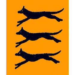
In 1974, the Wolves added two more leaping wolves leaping on top of each other all in black on an orange background.
Wolverhampton Wanderers FC
1970 - 1974
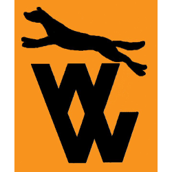
In the 1970s, Wolves introduced their own club badge consisting of a single leaping black wolf over two letter "W" stacked on top of each other in black.

Wolverhampton Wanderers FC
1921 - 1970
The first such badge to be worn on Wolves shirts was the coat of arms of Wolverhampton City Council. The club adopt the coat of arm as their official crest which carried the motto "Out of Darkness Cometh Light."
Wolverhampton Wanderers FC Primary Logo
Wolverhampton Wanderers Football Club is an iconic English football team with a long and storied history. The club’s primary logo has changed several times over the years, but it has always retained its core elements. This essay will explore the evolution of Wolverhampton Wanderers FC’s primary logo from its inception in 1888 to the present day.
The first iteration of Wolverhampton Wanderers FC's primary logo was designed in 1888 when the team was founded as St Luke's F.C., making it one of England’s oldest logos still in use today by any professional sports organization. It featured two wolves head-to-head inside a shield shape with a red border, which symbolized strength and loyalty—two values that remain at the heart of Wolves' identity even today! In 1949, this design was slightly altered to add more detail such as stars around each wolf head and thicker lines within their fur patterning; however, these changes were minor compared to later alterations made during subsequent decades like adding shading or changing colors entirely (from black & white to blue & gold).
In 2003, Wolverhampton Wanderers underwent yet another rebranding effort which resulted in their current version: two stylized wolves facing away from each other on either side of an oval shield containing three stars above them representing past successes (the FA Cup wins). This modern interpretation retains many familiar aspects while also introducing some new ones such as bolder outlines for both animals plus brighter colors—allowing Wolves fans everywhere proudly display their beloved crest on everything from t-shirts and hats all way up through large banners hung outside stadiums before matches! Overall this latest redesign offers supporters something fresh yet timelessly classic at the same time - perfectly encapsulating what makes ‘Wolves' so special after almost 130 years!
College Sports Fan Products


