
Vancouver Canucks
A dark blue, white and grey Orca whale bursting out of the ice in the shape of a letter “C.” The arched “VANCOUVER” wordmark removed for 2019 – 2020 season.

Vancouver Canucks
2008 - 2020
They kept the orca whale logo but changed the team’s colors to match the original 1970 - 1971 look. The wordmark "VANCOUVER" was added to the chest area above the orca. The "C" represents the nickname of the team Canucks.

Vancouver Canucks
1998 - 2008
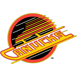
In 1997 the Canucks unveiled a new logo, in which a Haida style orca whale breaking out of a patch of ice forms a stylized "C". The logo has been much maligned, accused of being a blatant reference to their parent company, Orca Bay, now Canucks Sports and Entertainment. The letter "C" stands for the team nickname Canucks. The "C" represents the nickname of the team Canucks.

Vancouver Canucks
1993 - 1998
A wordmark "CANUCKS" in a diagonal slant as part the skate blade of a black, orange, and gold skate inside a black and orange circle.
Referred to as the "Flying Skate."
A new shade of red.
Vancouver Canucks
1979 - 1993
The new logo consisted of the wordmark "CANUCKS" in a diagonal slant as part the skate blade of a black, orange, and gold skate inside a black and orange circle.
Referred to as the "Flying Skate."

Vancouver Canucks
1971 - 1979
North Vancouver’s Joe Borovich hit the nail on the head with his "Stick in Rink" design for the very first Vancouver Canucks NHL logo. The blue and green color combination connect well and the stick that breaks up the oval makes the logo into a “C” formation for Canucks.
The Fierce Vancouver Canucks Logo
Vancouver Canucks primary logos energize hockey games with bold style. Vancouver Canucks logo history, including Vancouver Canucks logo animal designs, drives fan passion. Furthermore, logo artwork attracts collectors with sharp detail. Visit the official Vancouver Canucks Wikipedia page. Consequently, fans value Canucks hockey heritage. They celebrate the fierce primary logo identity with enthusiasm.
Sports Fan Products


Hey, Canucks Fans - Cast Our Vote!
Step into the thrilling NHL Team Logo Battle, where the Vancouver Canucks logo stands as a proud symbol of tenacious spirit and unwavering resilience. The iconic orca breaking through the ice reflects the team’s inspiring history and lasting strength. Deeply connected to the vibrant spirit of Vancouver, it represents the Canucks’ power, relentless drive, and loyal fans. Supporters wear it proudly at every game, showing steadfast devotion. In this competition, our logo doesn’t just stand out—it bursts forth, representing Vancouver’s pride and determination.
Click to go to NHL Logo Battle and vote


