Major League Soccer has seen consistent growth over the past decade in the United States. So much growth that the league is now seeing expansion teams join the league and two of them have popped up in St. Louis and Charlotte.
Neither team has a particularly spectacular name like the newest NHL expansion team, the Seattle Kraken, but soccer has never been about the flash. Charlotte FC and St. Louis City FC will soon begin to play in the MLS. Charlotte adds another professional sports team to their resume, along with the Carolina Panthers of the NFL and the Charlotte Hornets of the NBA, and the city of St. Louis replaces the recent loss of their NFL franchise with a traditional futbol team. Both cities should see an immediate impact in fan support as the MLS did extensive research into which markets would work best and both Charlotte and St. Louis came up green.
Charlotte FC is a franchise owned by David Tepper, who also owns the Carolina Panthers. You may notice some similarities in the color scheme from the Panthers to Charlotte FC. The Carolina Blue is almost identical to the Panthers logo with the black and white being the secondary and tertiary colors.

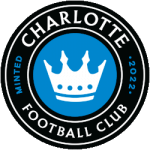
Charlotte FC Primary Logo 2022 - Present
The crown that is the centerpiece of the logo refers to the “Queen City”, the nickname of the city of Charlotte. The four-points on the crown refer to the four wards of Uptown Charlotte. The reason the logo is shaped like a coin is no coincidence either. The coin shape is a reference to the city’s banking industry, hence the “Minted 2022” writing on the left and right side of the logo. This looks like a very classic and minimal logo that you may see with some European teams, such as Chelsea FC or Manchester City.
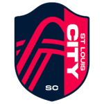
St. Louis City’s logo resembles a shield and over 20 local designers were brought in to collaborate on the creation of the team’s logo. If you know the city of St. Louis, you immediately notice the Gateway Arch, the iconic landmark of the city. The top of the shield follows the exact same curve as the arch in the center of the logo.

St. Louis City SC Primary Logo 2023 - Present
The horizontal lines featured in the logo represent the two rivers that run through the region: The Mississippi River and Missouri River. Lastly, the “SC” seen as the bottom-middle of the logo has a double-meaning according to the creators. It stands for the traditional “Soccer Club” like most franchises have (also seen as FC for Football Club) but it also stands for “Soccer Capital”, paying homage to the city’s history.
Each team has decided to focus on their city’s history when it comes to their identity and that is what they should do being the new team in the city. If you plan to respect the city and pay homage to the people there, fans will start pouring in. After that, all you have to do is win.
___
Sports Logo History is a vibrant community of sports logo enthusiasts who share a deep appreciation for the captivating histories behind each team's logo. We take pleasure in exploring the evolution of primary logos, alternate logos, and wordmark logos from renowned leagues such as the NFL, NBA, MLB, MLS, NHL, Premier League, WNBA, CFL, NCAA, UFL, ABA, USFL, AAF, and XFL. Immerse yourself in the intricate details and stories behind these iconic symbols that represent the essence of each team.
In the enthralling realm of sports, the battle of logos among different leagues unfolds as a captivating and ongoing spectacle. Step into the world of Sports Logo History, where we showcase the relentless pursuit of distinction by leagues such as the NFL, NBA, MLB, Premier League, and countless others. Witness the captivating journey as each league strives to create logos that not only capture the essence of their sport but also resonate deeply with fans.
Immerse yourself in the comprehensive sports history provided by Sports Team History, our esteemed partner site, where you can discover the triumphs, challenges, and defining moments that have shaped the legacies of professional sports teams. Stay up to date with the latest sports news through Sports News History, a platform delivering 24/7 coverage of highlights, player interviews, and game analyses. Additionally, express your unwavering support for your favorite teams by exploring Sports Store History, the premier sports team marketplace offering a vast selection of jerseys, memorabilia, and collectibles. Join our community today and celebrate the rich history, iconic logos, and passion of sports.

