Throughout the history of the NHL, many logos have stayed within the hearts and minds of fans. Logos help to connect a fan to its favorite team just like a customer connects with their favorite brand. The logo is especially poignant to a fan when it is synonymous with success, especially in the form of championships.
A sports fan stands a better chance of winning all of the Sunday Night Football Odds in a given week than pretending that they are emotionally connected to a logo. In this piece, we will go over the top 5 logos in the history of the National Hockey League.
5. Boston Bruins

Boston Bruins Primary Logo 1950 - 1995
There is no question that the primary logo of this Original Six franchise has had tremendous staying power. The current logo of the Boston Bruins has been around since 1950. It has always been a circular logo. Initially, the circular logo consisted of a bold black outline. The inner portion of the circle consists of eight spokes that are purely yellow. Three spokes can be seen on the top. One is on the left side of the circle, while another one is on the right. There are also 3 spokes on the bottom.
A big “B” wordmark is contained in the center of the circle. The “B” wordmark is black and has a thin yellow outline. The first version of this primary logo lasted for over four decades.
In recent years, the primary logo was modified so that the thick outline of the logo was not just purely black. A thin yellow line was added to the exterior. Additionally, the yellow spokes contained within the circle have black outlines on all of their exteriors.
4. Chicago Blackhawks
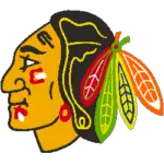
Chicago Black Hawks Primary Logo 1966 - 1986
Similar to the Boston Bruins, the Chicago Blackhawks have had a primary logo that has had an extensive amount of staying power. As a matter of fact, the primary logo of the Chicago Blackhawks has been around for nearly six decades. The first version of this logo was established in 1966. The primary logo consists of the head of a Blackhawk chief. Over the years, the logo has been modified with regard to its facial features. Modifications were made to the outline made within the hair as well as the color of the feathers.
The Chicago Blackhawks are also an Original Six franchise. Clearly, there is a great deal of brand loyalty that has led to the staying power of this logo.
3. Detroit Red Wings
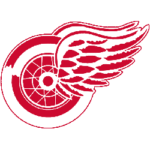
Detroit Red Wings Primary Logo 1932 - 1947
One would find it hard-pressed to find a logo with as much staying power as the logo of the Detroit Red Wings. It’s not a surprise, given that the Detroit Red Wings are also an Original Six franchise and have a grand total of 11 Stanley Cup Championships in franchise history. Why should one go away from a logo when it’s become a symbol of success?
The first version of this logo was established in 1933. The whole logo has a color scheme of red and white. The logo consists of a car wheel that is partially obscured by two wings that arise from the center of the wheel. In the original logo, the car wheel and the two wings were a little bit similar in size. It lasted for 16 years.
The Red Wings have had their current logo since 1949. A significant modification was that the wheel was smaller in size while the wings coming from the center of the car were larger and lengthier.
2. Pittsburgh Penguins
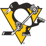
Pittsburgh Penguins Primary Logo 1973 - 1992
If one is looking for the origin of the Pittsburgh Penguins’ current logo, one has to go back to 1973. The logo consists of an intense-looking penguin that looks like he just fired off a slapshot. A yellow triangle with a thin black outline can be seen in the background. It lasted for 19 years. After that, the franchise would go in a completely different direction for 10 years before reverting back to this logo format in 2003.
The significant difference in this logo format is in regards to the triangle in the background. From 2003-2006, the triangle in the background went from yellow to a darker Vegas gold. After that, the color of the triangle would be modified to a lighter version of Vegas gold before going back to its original color of yellow.
1. San Jose Sharks
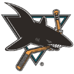
San Jose Sharks Primary Logo 1992 - 1998
When one looks at the current logo of the San Jose Sharks, it reeks of intimidation. The first version of this logo can be traced all the way back to 1992. The logo consisted of a black shark with a tiny white outline around it. The shark has a menacing look and has an entire hockey stick between his teeth.
In 2008, the Sharks would adopt its current logo. They would change the color scheme of the shark from black with a thin outline to a color scheme of teal and black. The teal can be seen on the front of the shark, while the black can be seen on its fins and on its back. The shark is still biting on a hockey stick, except that the stick has completely snapped in half.
Sports Logo History is a community of sports logo enthusiast who enjoys the history of each team’s logo history. Sports Logo History has primary logos, alternate logos, or wordmark logos from the NFL, NBA, MLB, MLS, NHL, Premier League, WNBA, CFL, NCAA, ABA, USFL, AAF, and XFL.
Our partner site is Sports Team History takes a look at the history of each and every professional sports team. In addition, we have added Sports News History to our sports history websites. 24/7 non-stop sports news that's worth knowing. Finally, the premier sports team marketplace for your favorite team or college with thousands of items for you to peruse at Sports Market History.

