Whether you’re new to basketball and would need to read an NBA betting guide to place a sporting bet, or you’re a passionate fan, there are probably a few basketball team logos you’re familiar with. Everyone is familiar with the yellow & purple colors of the LA Lakers logo and the red bull featured on anything to do with the Chicago Bulls. Whether we’re placing a bet, watching every game, or just have a passing interest in basketball, they are logos pretty much everyone is familiar with.
The Sacramento Kings Logo

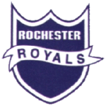
Rochester Royals Primary Logo 1946 - 1957
As one of the oldest basketball teams in America, you might assume that the Sacramento Kings have gone through some changes of branding in their time – and you wouldn’t be wrong. The team was founded back in the 1920s when it was considered a semi-professional team. It was a good few years later in 1945 that it became part of the National Basketball League – although the team then was known as the Rochester Royals, named after its hometown.
It was in 1949 the team became part of the National Basketball Association and the colors of the logo went through their first change – changing to white and royal blue.
The Royals Head to Cincinnati
Still based in Rochester they had a strong few years and in 1957 had to move out of their hometown to a much bigger city. Although the Rochester Royals were then based in the city Cincinnati, they were keen to keep their roots with the team name written on the logo twice and the team colors staying the same. Although eventually, they decided to add some red to the mix, and the position of the inscription was also changed.
On The Move Again to Kansas City

Kansas City-Omaha Kings Primary Logo 1973 - 1975
Things for the team didn’t go as well in Cincinnati and so they went on the move once again. Between 1972 and 1975 they played home games between Kansas City and Omaha, unable to decide which would be best. This move forced the Rochester Royals to change their name, as there was already a sports team (baseball) in Kansas. For some time they were known as the Kansas City-Omaha Kings and this name was printed on any memorabilia that had their logo on, as well as the team's uniform t-shirts.
A Final Move to CA

Sacramento Kings Primary Logo 2016 - Present
It was in 1985 that the team made their final move – this time to California. They settled in the city of Sacramento, where they are still based today. At this time it made sense to change their name to the Sacramento Kings. This led to another slight logo change – where the shade of blue in the logo was changed to cyan. They also decided to add a crown above the letter I to replace the dot that was there previously.
It was in the early 1990s that the logo would go through its next change – black and purple were added into the mix. The first version didn’t go down well and neither did the alternative version that was suggested at the time. In the 2000s purple took a leading part in the logo colors and in 2005 a golden version of the logo was introduced although due to lack of love from fans this quickly disappeared.
The version of the logo we have now which is largely purple and grey was quite a change from the previous one, which had been in place since 1995. However, it is quite well-liked by fans who especially like the way it looks like a crown; which is something that has been seen in many of the logo designs that the Sacramento Kings have had over the years.
See the Sacramento Kings logo history and team history.
Sports Logo History is a community of sports logo enthusiast who enjoys the history of each team’s logo history. Sports Logo History has primary logos, alternate logos, wordmark logos, or concept logos from the NFL, NBA, MLB, MLS, NHL, Premier League, WNBA, CFL, NCAA, ABA, USFL, AAF, and XFL.
Our partner site is Sports Team History takes a look at the history of each and every professional sports team. In addition, we have added Sports News History to our sports history websites. 24/7 non-stop sports news that's worth knowing.


