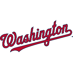
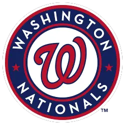
Nationals Wordmark Logo The Washington Nationals have had a long and storied history with their wordmark logo. The original logo, which was introduced in 2005, featured the team’s name written out in an italicized font with a red line running through it. This design was used until 2011 when the team made some changes to their branding. The new logo …
Washington Nationals Alternate Logo
Nationals Alternate Logo The Washington Nationals have had a long and storied history of alternate logos. From the classic “W” logo to the more modern “Screech” design, these logos have been an integral part of the team’s identity over its lifetime. The original “W” logo was introduced in 2005 when the team moved from Montreal to Washington D.C., and it …
Washington Nationals Primary Logo
Nationals Primary Logo The Washington Nationals have a long and storied history of logos, beginning with their first logo in 2005. The original logo featured a white “W” on top of an outline of the Capitol Building in red and blue. This was intended to represent the team’s connection to its nation’s capital city, as well as symbolize strength and …