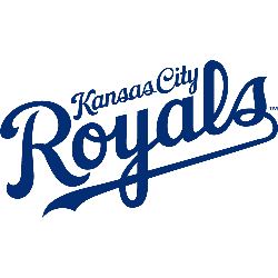
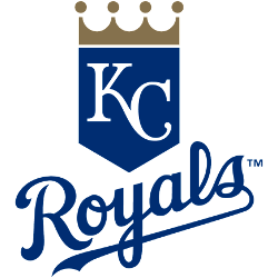
Kansas City Royals 2019 – Present The initials for Kansas City, “KC” on blue shield with gold crown. Royals Alternate LogoRoyals Primary LogoRoyals Team HistoryRoyals Team MerchRoyals Wordmark Logo The Kansas City Royals have a long and storied history, which is reflected in their wordmark logo, particularly in relation to the Kansas City Royals Primary logo. The original Royals logo …