Whenever the WNBA plays next, the New York Liberty will be moving to Brooklyn’s Barclays Center. The franchise will mark this momentous occasion in their history with its first logo change since the it came into existence with the WNBA itself in 1997. Gone is the orange and blue in the color scheme, which makes since given that the team …

New York Liberty Logo History WNBA – Wordmark Logo
The New York Liberty logo, a striking wordmark, anchors the New York Liberty WNBA identity. Since 1997, its bold text in seafoam and navy glows in New York Liberty basketball games. For example, the wordmark, showing “LIBERTY,” reflects Breanna Stewart’s 2023 Finals run. Curious about the New York Liberty logo PNG? See this wordmark’s role in the team’s legacy! New …

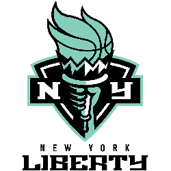
New York Liberty Logo History WNBA – Alternate Logo
The New York Liberty logo, as an alternate design, shines with New York Liberty WNBA pride. Evolving since 1997, these logos, in bold seafoam and black, fuel New York Liberty basketball games. From the 2019 “NY” to the 2011 torch, alternate New York Liberty logo PNG designs reflect Brooklyn’s spirit. See their iconic journey. New York Liberty 2020 – Present …
New York Liberty Logo WNBA – Primary Logo
The New York Liberty logo captures New York Liberty WNBA pride, evolving since 1997. Its bold design fuels New York Liberty basketball energy, with vibrant green and black hues. Available as a New York Liberty logo PNG, the primary logos reflect the team’s iconic legacy. See how they mark Liberty’s journey in New York. New York Liberty 2020 – Present …