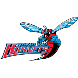
Charlotte Hornets (Pelicans) Primary Logo
The expansion Charlotte Hornets first and the only logo has a fun loving hornet dribbling a basketball. The design and color combination is nice, using teal in a logo always seems to be a hit. (adsbygoogle = window.adsbygoogle || []).push({}); Hornets Alternate Logo Hornets Team History amzn_assoc_placement = “adunit0”; amzn_assoc_tracking_id = “yorkshirete03-20”; amzn_assoc_ad_mode = “search”; amzn_assoc_ad_type = “smart”; amzn_assoc_marketplace = …
New Orleans Hornets Primary Logo
Arriving in New Orleans in 2003, the Hornets took the same hornet design concept from Charlotte and continued with it in the south. New color changes and a different font as well. (adsbygoogle = window.adsbygoogle || []).push({}); Hornets Alternate Logo Hornets Wordmark Logo Hornets Concept Logo Hornets Team History amzn_assoc_placement = “adunit0”; amzn_assoc_tracking_id = “yorkshirete03-20”; amzn_assoc_ad_mode = “search”; amzn_assoc_ad_type = …
Charlotte Hornets Primary Logo
“We recognize the heritage behind the original logo and our goal was to connect to the past but also include elements of evolution,” Fred Whitfield added. The city’s rebelliousness, aggressiveness, and protective attributes date to the Revolutionary War when British commander General Cornwallis referred to Charlotte as “a hornet’s nest of rebellion.” (adsbygoogle = window.adsbygoogle || []).push({}); Hornets Alternate Logo …