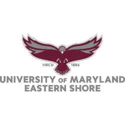
Hawks Primary Logo The St Joseph’s Hawks started with a cartoon-looking hawk as their primary logo and update the logo in 2001. The new and updated hawk is a high soaring hawk looking down on its prey. Hawks Alternate LogoHawks Wordmark Logo Choose your favorite St. Joseph’s Hawks primary logo? St. Joseph’s Hawks Primary Logo 2019 – Present St. Joseph’s …
Milwaukee Hawks Primary Logo
Hawks Primary Logo During their 3 years in Milwaukee, the Milwaukee Hawks had two versions of the same logo. After relocating from Tri-City to Milwaukee the Hawks used a high-flying hawk above a basketball hoop carrying a basketball. Hawks Wordmark LogoHawks Team History Sports Logo History thanks you for visiting our logo site. If you are using any of our …
St. Louis Hawks Primary Logo
Hawks Primary Logo The St. Louis Hawks’ first logo of a flying hawk carrying a basketball in its claws, looks like it might have been thrown together very quickly. Not much detail to this logo. The second and final logo in St. Louis has character. The hawk holding a basketball has greater detail for us to see the hawk and …
Atlanta Hawks Primary Logo
Hawks Primary Logo “Our fans have been so excited by the return of the iconic Pac-Man logo,” CEO Steve Koonin of the Atlanta Hawks said. In 2021, the Hawks changed the font used in the wordmark and remove the word “CLUB” from their primary logo. Hawks Alternate LogoHawks Wordmark LogoHawks Team History Choose your favorite reverse pacman Atlanta Hawks logo? …