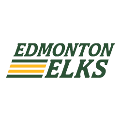
For the past 50 years, Edmonton’s Canadian Football League team was known as the Eskimos. Now, due to social pressure and the changing times, Edmonton will rock a brand new identity and logo. Edmonton Elks Primary Logo 2021 – Present When the Washington Redskins dropped their nickname due to tensions about the racist nature of the name, there were waves …
Edmonton Elks Logo History – Wordmark Logo
The Edmonton Elks logo history reflects the evolution of the team’s typography and branding direction. Each Edmonton Elks wordmark logo highlights changes in lettering style and visual balance. This archive preserves every version and includes downloadable Edmonton Elks logo PNG files from early designs to modern updates. Edmonton Elks 2025 – Present A letter “E” twice in green with gold …
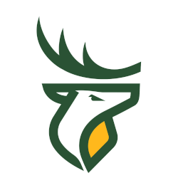
Edmonton Elks Logo History – Alternate Logo
The Edmonton Elks logo history reflects decades of visual evolution. Beyond the primary mark, each Edmonton Elks alternate logo has strengthened the team’s identity through distinct design updates. This archive presents every variation and includes downloadable Edmonton Elks logo PNG files, preserving alternate branding from early eras to the modern franchise. Edmonton Elks 2025 – Present A letter “E” twice …
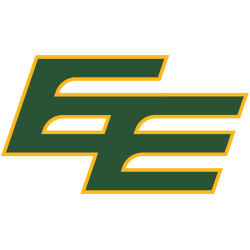
Edmonton Elks Logo History – Primary Logo
The Edmonton Elks logo history reflects a proud football tradition and a modern rebranding era. Over time, the Edmonton Elks primary logo has evolved while maintaining strong regional identity. This page showcases every official version and includes downloadable Edmonton Elks logo PNG files from past to present. Edmonton Elks 2025 – Present A letter “E” twice in green with gold …
CFL Logo History – All CFL Teams Primary Logo Evolution
The CFL logo history reflects the growth and national identity of Canada’s premier football league. Over the decades, the CFL primary logo has evolved while maintaining strong symbolic elements. This page documents every major design update and highlights how Canadian Football League teams helped shape the league’s unified brand.CFL Alternate LogoCFL Wordmark LogoCFL Logo BattleCFL Team History BC Lions A …