The NHL has some fascinating stories behind its primary logos, and in this guide, we’re diving into those logos as well as the overall NHL logo, which is a very famous shield design. The shield logo is said to have been introduced in 1946, but some people claim it dates back to the league’s inception in 1917. The original shield …
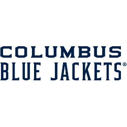
Columbus Blue Jackets Logo History – Wordmark Logo
The Columbus Blue Jackets logo shines in the team’s wordmark logo collection, evolving since 2000 in the NHL. Its sleek text design reflects Ohio’s proud spirit. Therefore, the Columbus Blue Jackets logo history captivates collectors. Moreover, the Columbus Blue Jackets NHL emblem showcases vibrant identity and regional pride. Columbus Blue Jackets 2008 – Present The red, white and blue flag …
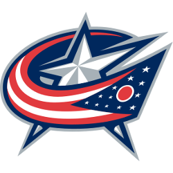
Columbus Blue Jackets Logo History – Primary Logo
The Columbus Blue Jackets primary logo collection highlights the team’s bold NHL history. With sharp star and flag designs, the Columbus Blue Jackets logo ignites team spirit. This collection explores team history, linking fans to the vibrant legacy of Columbus Blue Jackets hockey. Columbus Blue Jackets 2008 – Present The red, white and blue flag is wrapping around the white …