The story of the Carolina Panthers, a notable team in the NFL, is an interesting one about their identity and growth, reflected in their well-known logo. Since joining the league, their logo has symbolized their connection to the Carolinas and their strong character. Over time, especially with a significant update in 2012, the logo evolved to keep pace with the …
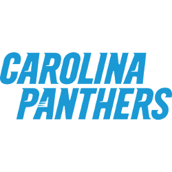
Carolina Panthers Logo History – Wordmark Logo
The Carolina Panthers logo wordmark showcases sleek, italicized letters that lean forward with speed and intensity. This energetic typeface reflects the team’s fast-paced style on the field. Most often rendered in black or blue, the design feels sharp and modern. Paired with the panther icon, it forms a unified identity. Over time, this style has remained consistent, keeping the spirit …

Carolina Panthers Logo History – Alternate Logo
The Carolina Panthers logo is known for its fierce black panther head. But the team has introduced several alternate logos over time. These versions bring variety to the brand. Some feature different shapes, while others adjust the color or angle. Each alternate reflects a moment in time, blending tradition with a fresh look for fans and collectors. Carolina Panthers 2012 …

Carolina Panthers Logo – Panther’s Primary Logo Evolution
The Carolina Panthers logo is a sleek, modern emblem that captures the team’s fierce energy and bold spirit. Over the years, it has become a symbol of strength and pride. From high-resolution Carolina Panthers logo pictures to exploring the full Carolina Panthers logo history, this emblem continues to represent the team’s evolution and commitment to excellence. Carolina Panthers 2012 – …