Earlier this offseason, we talked about how the San Diego Padres were the latest Major League Baseball team to look to the past for their new uniform, as San Diego will be once again decked out in brown and yellow next season. Toronto, Houston, and Baltimore Orioles started this trend, and now, add the Milwaukee Brewers to the list. Just …
Brewers “M-Barley” Primary Logo Now Official
Milwaukee Brewers Primary Logo 2018 – 2019 For the 2018 season, the Milwaukee Brewers have changed their primary logo for the sixth time in 48 years, moving to the typical letter logo that is widespread throughout Major League Baseball. The Brewers have been very stealth about the change, as they have been using this logo for many years since it …
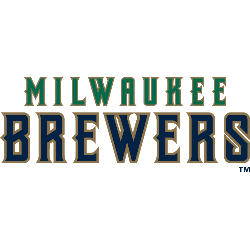
Milwaukee Brewers Wordmark Logo
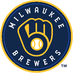
Milwaukee Brewers 2020 – Present An “M” and a “B” in the shape of a baseball glove in navy, royal blue, and yellow inside a circle with wordmark “MILWAUKEE BREWERS” in white written around it. Brewers Alternate LogoBrewers Primary LogoBrewers Team HistoryBrewers Team MerchBrewers Wordmark Logo The Milwaukee Brewers wordmark logo has been a symbol of the city’s baseball team …

Milwaukee Brewers Alternate Logo
Milwaukee Brewers 2020 – Present An “M” and a “B” in the shape of a baseball glove in navy, royal blue, and yellow inside a circle with wordmark “MILWAUKEE BREWERS” in white written around it. Brewers Primary LogoBrewers Wordmark LogoBrewers Team HistoryBrewers Team MerchBrewers Alternate Logo The Milwaukee Brewers have a long and storied history of alternate logos, particularly in …
Milwaukee Brewers Primary Logo
Milwaukee Brewers 2020 – Present An “M” and a “B” in the shape of a baseball glove in navy, royal blue, and yellow inside a circle with wordmark “MILWAUKEE BREWERS” in white written around it. Brewers Alternate LogoBrewers Wordmark LogoBrewers Team HistoryBrewers Team MerchBrewers Primary Logo The Milwaukee Brewers have a long and storied history in Major League Baseball, which …
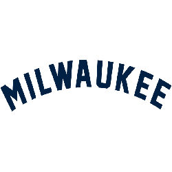
Milwaukee Brewers (Orioles) Primary Logo
Milwaukee Brewers 1900 – 1901 Like most teams before 1900, the logo was a wordmark of the city “MILWAUKEE” in an arched pattern.Brewers Team HistoryBrewers Primary Logo The Milwaukee Brewers have a long and storied history, dating back to their inception in 1900. The team has gone through several name changes over the years, but one thing that remains constant …