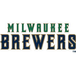
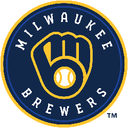
Brewers Wordmark Logo The Milwaukee Brewers’ wordmark history is very unimpressive. Their last wordmark logo is from 1999, over 15 years ago. Time for a new logo! Brewers Alternate LogoBrewers Primary LogoBrewers Team History Select your favorite Milwaukee Brewers wordmark logo? Milwaukee Brewers Wordmark Logo 2020 – Present Milwaukee Brewers Wordmark Logo 1998 – 1999 Milwaukee Brewers Wordmark Logo 1978 …
Milwaukee Brewers Alternate Logo
Brewers Alternate Logo “The team’s new color palette is anchored by the navy, which the Milwaukee Brewers have proudly worn since 1994. Accompanying navy is the colors yellow and royal blue. The yellow represents our city’s rich brewing legacy and joyful nature, while the royal blue represents the era that produced two postseason berths and a World Series appearance.” Brewers …
Milwaukee Brewers Primary Logo
Brewers Primary Logo The Milwaukee Brewers gave their new logo some modern flourishes, connecting the “m” and “b” that form the baseball glove, changing the color from royal blue to navy blue, and putting two seams on a now-centered baseball to give it a more authentic look. Club president of baseball operations Rick Schlesinger said the intent was to stay …