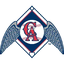
Los Angeles Angels Concept Poll
Los Angeles Angels Concept Logo by SFGiants58
By SFGiants58 - Graphic Designer Website
Year: 2017
Los Angeles Angels had many looks, some wilder than others. I decided to convert the Dodgers' script style to the "Angels" name, albeit with the addition of red halos. I also added a light blue outline to all of the elements, as a way to differentiate the team from it's Brooklyn past and to incorporate the bright colors of Chavez Ravine Stadium. It also helped that the Dodgers had a past with light blue (see the Part I concept), so its addition wouldn't be out of place for the period. The primary logo uses a baseball with the new "LA" insignia (based on the 1958-71 cap logo) and the wings from my AL Angels concept.

Los Angeles Angels Concept Logo By Bryce Reyes
By Bryce Reyes - Graphic Designer Website
Year: 2017
Tinkering again with the Angels Baseball logo. The team originated in LA and it was at a time when the Mid-Century Modern movement was at its height. I thought I would challenge the notion of these "traditional" baseball logos and have something reflected the time the vibe of the city.

Los Angeles Angels Concept Logo By TheGreatKtulu
By TheGreatKtulu - Graphic Designer Website
Year: 2014
Basically, a merger of the Disney-ified logo that no one liked and their classic "A."
