Just recently, it was revealed that Brown University’s athletic and recreation division has just released a new set of logos in order to provide a fresh start to its brand identity. According to Brown VP M. Grace Calhoun, this action represented a new day for Brown University. The school’s chief communication officer believes that the new logos would generate a profound sense of excitement in the university’s community.
 Sports Logo History
 In order to get an idea of the significance of the change in Brown University’s athletic logo, it is important that we take a look at the primary logo history of Brown University.
The first primary logo for the Brown Bears was introduced in 1973 and lasted until 1992. The first logo is a growling bear in silhouette form. The silhouette is colored brown. However, the silhouette of a growling bear is contained within a letter “B” that is colored white. All of this is contained within a dark brown circle.
In 1997, Brown University went in an entirely different direction with its logo. One cannot help but immediately pay attention to the big red, brown, and black bear that can be on the top of the logo. One can see that both of his claws are holding a big “BROWN” wordmark. Appropriately, the “BROWN” wordmark is colored brown with a white outline.
Below the “BROWN” wordmark, one can see a smaller “BEARS” wordmark. It is also colored brown with a white outline. However, the “BEARS” wordmark is contained within a red banner. All of the aforementioned designs and wordmark is contained within a shield that is brown and red. This logo lasted until 2009.
In 2009, the logo was changed to a simpler version. The same “BROWN” wordmark from the previous logo can still be seen. Right below the “BROWN” wordmark, one can see a bear’s head. It is red, brown and black. Additionally, the bear’s head is similar to the one in the previous logo. This logo lasted until the present year.
 Sports Logo History
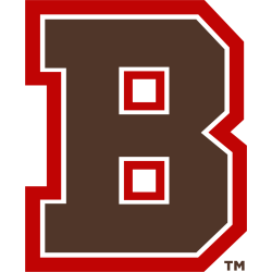
 Brown University’s new primary logo is a brown wordmark “B” that is stylized. The logo also contains a slim white outline and a bold red outline. With this change, Brown University emulated other Ivy League schools such as Harvard, Yale, and Dartmouth. Those schools also use single letters for their primary logo.
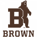
Additionally, the school released a really cool-looking secondary logo. This logo consists of the aforementioned brown wordmark “B” with white and red outlines. Right towards the end of the logo, one can see a standing bear who appears to be growling ferociously.
Vote for the Brown Bears logo at the Ivy League Logo Battle

