

Founded in 1967 as part of a six-team NHL expansion, the St Louis Blues have since established themselves as one of the top franchises in ice hockey.
The Blues regularly progress to the playoffs, although winning the Stanley Cup has largely proved elusive during their history.
Stanley Cup Winner
However, they famously finished the job in 2019, defeating the Boston Bruins 4-3 in a hugely entertaining seven-game series.
While home advantage in Game Seven saw the Blues favored by the NHL odds, seeing off the challenge of a stacked Bruins roster was still a massive achievement.
Their victory sparked wild celebrations in St Louis, with former star forward Brett Hull among the club legends who were on hand to share in the joyous moment.
Hull admitted in a recent interview that the Blues’ Stanley Cup victory success was a fitting reward for a fanbase that has stuck with the club ‘through thick and thin.’
Their loyalty is undoubtedly borne out of the city’s ethos of ‘strength and courage,’ which was embedded in the club's fabric from the outset.
The Original Logo

St. Louis Blues Primary Logo 1968 - 1978
The Blues’ original logo, used until 1978, represented a light blue musical note with a wing to the right of the stem.
The wing element was particularly noteworthy, as this was designed to depict the dynamism that has long been associated with St Louis.
However, as with most top-class sports organizations, the Blues have tweaked their logo several times to keep it modern.
Roundel Logo
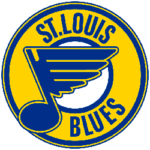
St. Louis Blues Primary Logo 1979 - 1984
The wordmark and roundel around the note were changed in 1978/79, with the final design looking much bulkier. The team’s name was also incorporated in the logo.
The note remained central to the design as numerous changes were made during the 1980s, with the addition of red and the removal of the name ‘Blues’ being the most notable changes.
The Blues ditched red from their logo in 1998 and opted for a darker blue in the note. The wordmark St Louis was also removed and has never returned.
Recent Logos
The most recent change to the club logo was made in 2009, with the core blue lightened again and the note lines sharpened through digital design processes.

St. Louis Blues Primary Logo 2009 - Present
The ‘Blue Note’ was taken from the music scale and represented the team’s name. The outer line is a darker blue, giving more definition to the overall logo.
Yellow and white lines provide the finishing touches and are primarily used to pick out those all-important wings that have been ever-present throughout the logo’s evolution.
While Blues fans can rightly be proud of their iconic logo, it would be fair to say it has not brought them much luck this season.
A home defeat against the Boston Bruins earlier this month ended the Blues’ play-off hopes – the first time they had missed the post-season since the 2017/18 campaign.
Despite that disappointment, it should not be too long before the Blues fight for honors in the NHL again.