

Skip to content

SPORTS LOGO HISTORY

Sports Logo HistorySports Logo History
  • Logos Type
    • Alternate Logo History
    • Primary Logo History
    • Wordmark Logo History
  • League Logos
    • AAF Logo History
    • ABA Logo History
    • CFL Logo History
    • NCAA Logo History
    • MLB Logo History
    • MLS Logo History
    • NBA Logo History
    • NFL Logo History
    • NHL Logo History
    • NWSL Logo History
    • Premier Logo History
    • UFL Logo History
    • USFL Logo History
    • WNBA Logo History
    • XFL Logo History
  • Logo Battle
  • Logo News
  • More…
    • Logo Videos
      • MLB Sports Videos
      • NBA Sports Videos
      • NCAA Sports Videos
      • NHL Sports Videos
      • NFL Sports Videos
      • Soccer Sports Videos
    • SHG YouTube Channel
      (opens in a new tab)
    • Sports Team History
    • Sports News History
    • Sports Store History
    • Sports Logo History Products
      (opens in a new tab)

Generic selectors
Exact matches only
Search in title
Search in content
Post Type Selectors
Search in posts
Search in pages

Generic selectors
Exact matches only
Search in title
Search in content
Post Type Selectors
Search in posts
Search in pages
SLH News - Jazz J-Note Logo

New Look and Branding for the Utah Jazz

When one thinks of the Utah Jazz, one cannot help but think about one of the greatest duos in NBA History:  Karl Malone and John Stockton. Over the years, Utah Jazz has had many changes to its primary logo and brand identifiers throughout its franchise history ever since it started in New Orleans.   

Two days ago, Utah Jazz announced sweeping changes to its logos.   

In order to get a broader perspective of the Jazz’s pending logo change, let’s take a look back at the logo history of the Utah Jazz. The first logo in franchise history lasted from 1975-1979. This logo is accentuated by the wordmark “JAZZ.” The letter J contains a basketball that is colored black, yellow, and red. Additionally, the letter J seems to resemble a musical note. 

The wordmark “JAZZ” is in purple. One will notice that there is a broken “A, “Z” AND Z” in this wordmark. Additionally, one cannot help but look at the purple “NEW ORLEANS” wordmark above the “JAZZ” wordmark. 

In 1980, the franchise would modify its logo once it moved to Salt Lake City, Utah. It was a very simple change. They removed the wordmark “NEW ORLEANS” from the top of their logo and replaced it with “UTAH.” The color for this wordmark is also purple. This logo lasted until 1996. 

In 1997, Utah Jazz would do a drastic change with regard to their logo. This logo contains a streaky “JAZZ” wordmark that was both colored blue and purple. The “JAZZ” logo was perfectly positioned against the mountains that can be seen in the background of the logo. The logo was positioned in the middle of a copper circle. This logo lasted until 2004. 

From 2005-2010, Utah Jazz would keep the same logo format. The major modification to their logo was to incorporate the franchise’s new color scheme. Their new scheme consisted of light blue, navy blue, purple, and silver. Another key change is that the “JAZZ” wordmark is no longer streaking. A silver “UTAH” wordmark can be seen on top. 

Just like its predecessor, the franchise would keep the same logo format, yet change the color scheme. The “JAZZ” wordmark changed from purple to white with a yellow outline. Additionally, the color of the “UTAH” wordmark was changed to white. This logo lasted from 2010-2015. 

From 2016 to now, the franchise would go back to the aforementioned logo format that lasted from 1980-1996. 
Utah Jazz New J-Note LogoSports Logo History

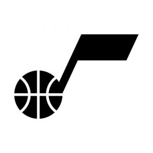
On Wednesday, Utah Jazz revealed a new logo that has the aforementioned “J” wordmark that resembles a musical note and has a basketball within it. This wordmark is on top. On the bottom of the logo,  A black “UTAH JAZZ” wordmark can be seen.

The color scheme for this logo is black except for when the logo can be seen on black apparel. In such a  case, the logo will be white. The logo is really simple and minimal. 

The “J” wordmark will be Jazz’s new primary icon. The team’s new wordmark logo is a vertical illustration of the word “UTAH JAZZ”. The “UTAH” wordmark can be seen on top while the “JAZZ” wordmark is on the bottom.

Sports Logo History is a community of sports logo enthusiast who enjoys the history of each team’s logo history. Sports Logo History has primary logos, alternate logos, or wordmark logos from the NFL, NBA, MLB, MLS, NHL, Premier League, WNBA, CFL, NCAA, ABA, USFL, AAF, and XFL.

Our partner site is Sports Team History takes a look at the history of each and every professional sports team. In addition, we have added Sports News History to our sports history websites. 24/7 non-stop sports news that's worth knowing. Finally, the premier sports team marketplace for your favorite team or college with thousands of items for you to peruse at Sports Market History.

When one thinks of the Utah Jazz, one cannot help but think about one of the greatest duos in NBA History:  Karl Malone and John Stockton. Over the years, Utah Jazz has had many changes to its primary logo and brand identifiers throughout its franchise history ever since it started in New Orleans.   

Two days ago, Utah Jazz announced sweeping changes to its logos.   

In order to get a broader perspective of the Jazz’s pending logo change, let’s take a look back at the logo history of the Utah Jazz. The first logo in franchise history lasted from 1975-1979. This logo is accentuated by the wordmark “JAZZ.” The letter J contains a basketball that is colored black, yellow, and red. Additionally, the letter J seems to resemble a musical note. 

The wordmark “JAZZ” is in purple. One will notice that there is a broken “A, “Z” AND Z” in this wordmark. Additionally, one cannot help but look at the purple “NEW ORLEANS” wordmark above the “JAZZ” wordmark. 

In 1980, the franchise would modify its logo once it moved to Salt Lake City, Utah. It was a very simple change. They removed the wordmark “NEW ORLEANS” from the top of their logo and replaced it with “UTAH.” The color for this wordmark is also purple. This logo lasted until 1996. 

In 1997, Utah Jazz would do a drastic change with regard to their logo. This logo contains a streaky “JAZZ” wordmark that was both colored blue and purple. The “JAZZ” logo was perfectly positioned against the mountains that can be seen in the background of the logo. The logo was positioned in the middle of a copper circle. This logo lasted until 2004. 

From 2005-2010, Utah Jazz would keep the same logo format. The major modification to their logo was to incorporate the franchise’s new color scheme. Their new scheme consisted of light blue, navy blue, purple, and silver. Another key change is that the “JAZZ” wordmark is no longer streaking. A silver “UTAH” wordmark can be seen on top. 

Just like its predecessor, the franchise would keep the same logo format, yet change the color scheme. The “JAZZ” wordmark changed from purple to white with a yellow outline. Additionally, the color of the “UTAH” wordmark was changed to white. This logo lasted from 2010-2015. 

From 2016 to now, the franchise would go back to the aforementioned logo format that lasted from 1980-1996. 

Utah Jazz New J-Note LogoSports Logo History

On Wednesday, Utah Jazz revealed a new logo that has the aforementioned “J” wordmark that resembles a musical note and has a basketball within it. This wordmark is on top. On the bottom of the logo,  A black “UTAH JAZZ” wordmark can be seen.

The color scheme for this logo is black except for when the logo can be seen on black apparel. In such a  case, the logo will be white. The logo is really simple and minimal. 

The “J” wordmark will be Jazz’s new primary icon. The team’s new wordmark logo is a vertical illustration of the word “UTAH JAZZ”. The “UTAH” wordmark can be seen on top while the “JAZZ” wordmark is on the bottom.

The Sports History Network

Explore the evolution of iconic team branding and professional sports legacies across our entire network at the Sports History Group.

Dive deeper into franchise legacies at Sports Team History, catch real-time highlights via Sports News History, or shop for authentic collectibles at Sports Store History.

Branding for the Utah JazzNew Look and Branding for the Utah JazzUtah Jazzutah jazz logoutah jazz logos

Sports Logo History Newsletter

Sign up for our newsletter to get the latest sports logo updates delivered directly to your inbox!

Sports History Group Videos

Sports History Group Videos

Sports News History

Sports News Worth Knowing

RSS feed: Headline News Headline News

  • Minnesota Lynx vs. New York Liberty | FULL GAME HIGHLIGHTS | September 29, 2026
  • Philadelphia Eagles vs. Chicago Bears Game Highlights | 2026 NFL Season Week 3
  • Sharks vs. Golden Knights | NHL Preseason Highlights | Sep 26, 2026
  • ASTROS vs. ATHLETICS: Official Full Game Highlights (September 25) | 2026 MLB Season
  • If Bronny has to guard LeBron this season #nba #animation #basketball #lebronjames

Advertisement

Sports Market History

Sports Team Marketplace of Champions!

SLH News

"Latest Sports Logo History News"

Teal Seasons: How Expansion Teams Chose Their Colors

October 1, 2026

Why Atlanta City FC is the Missing Piece in the NWSL’s Branding Evolution

October 1, 2026

Back From the Vault: Why NFL Throwback Logos Keep  Winning

September 29, 2026

Michigan’s Block “M” Has Outlasted Almost Everything Around It

September 29, 2026

From Minneapolis to Malibu: Jack Kent Cooke Lakers History from Powder Blue to Forum Purple

September 24, 2026

NBA Team Logos in the Digital Era: What Makes a Design Last?

September 15, 2026

How Color Choices Help Sports Teams Build a Recognizable Identity

September 11, 2026

SLH Prodcut Sale

Advertisement

(opens in a new tab)

Generic selectors
Exact matches only
Search in title
Search in content
Post Type Selectors
Search in posts
Search in pages

Sports Logo News

Teal Seasons: How Expansion Teams Chose Their Colors

October 1, 2026

Why Atlanta City FC is the Missing Piece in the NWSL’s Branding Evolution

October 1, 2026

Back From the Vault: Why NFL Throwback Logos Keep  Winning

September 29, 2026

Michigan’s Block “M” Has Outlasted Almost Everything Around It

September 29, 2026

From Minneapolis to Malibu: Jack Kent Cooke Lakers History from Powder Blue to Forum Purple

September 24, 2026

NBA Team Logos in the Digital Era: What Makes a Design Last?

September 15, 2026

How Color Choices Help Sports Teams Build a Recognizable Identity

September 11, 2026

From Tradition to Innovation: NFL Logo Changes in the 2020s

September 9, 2026

The 2026 NFL Rebrands: What the Titans, Rams and Bills Actually Changed

September 9, 2026

How NFL Rivalries’ Uniforms Build Team Identity

September 7, 2026

NBA Logo Redesigns: Complete Timeline of the Most Recent Changes

September 1, 2026

The Timeless Appeal: Secrets Behind the Baltimore Ravens Logo

August 31, 2026

Sports Logo Videos

Minnesota Wild Logo

The Minnesota Wild Logo Evolution: From Concept to Icon!

Angeles Chargers Logo

Los Angeles Chargers Logo Evolution: The Boldest Designs Yet

Cleveland Cavaliers Logo History

Did The Cleveland Cavaliers Ever Have The BEST Logo in Basketball?

Green Bay Packers Logo

Which Green Bay Packers Logo Is the Greatest? A Design Journey

Best Bengals Logo

What’s the Best Bengals Logo of All Time?

Brooklyn Nets Logo Evolution

Brooklyn Nets Logo Evolution That Will SHOCK You!

Las Vegas Raiders Logo History

Discovered the HIDDEN MEANING Behind the LV Raiders Logo

Alabama Crimson Tide Logo History

How Alabama’s Logo Became a CULTURAL ICON

UCLA Bruins Logo

UCLA Bruins Logo History Revealed: Jaw-Dropping!

Arizona Cardinals Logo History

Why the Arizona Cardinals Have the Coolest Logo in the NFL

Pittsburgh Pirates Logo History

100-Year Evolution of the Pittsburgh Pirates Logo Revealed!

Manchester United Logo History

5 Iconic Logo Designs That Changed Manchester United!

Sports Store History Logo
Sports Team History Logo
Sports News History Logo
Sports Store History Logo


Sports Logo History Logo

"It's not all about the Team, It's about the LOGO."


  • About
  • Contact Us
  • Disclaimer
  • Privacy Policy
© 2013 - 2026 - Sports History Group LLC - All Rights Reserved
  • Logos Type
    • Alternate Logo History
    • Primary Logo History
    • Wordmark Logo History
  • League Logos
    • AAF Logo History
    • ABA Logo History
    • CFL Logo History
    • NCAA Logo History
    • MLB Logo History
    • MLS Logo History
    • NBA Logo History
    • NFL Logo History
    • NHL Logo History
    • NWSL Logo History
    • Premier Logo History
    • UFL Logo History
    • USFL Logo History
    • WNBA Logo History
    • XFL Logo History
  • Logo Battle
  • Logo News
  • More…
    • Logo Videos
      • MLB Sports Videos
      • NBA Sports Videos
      • NCAA Sports Videos
      • NHL Sports Videos
      • NFL Sports Videos
      • Soccer Sports Videos
    • SHG YouTube Channel
      (opens in a new tab)
    • Sports Team History
    • Sports News History
    • Sports Store History
    • Sports Logo History Products
      (opens in a new tab)

Subscribe to Our YouTube Channel
We use cookies to ensure that we give you the best experience on our website. If you continue to use this site we will assume that you are happy with it.