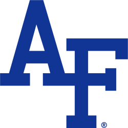
Air Force Falcons
The initials “AF” are connected together in blue. Slight change to the shade of blue again.
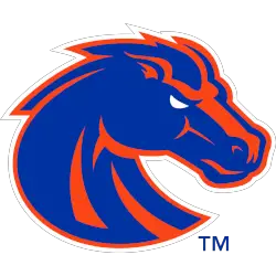
Boise State Broncos
A bronco's head in blue and orange, shaped like a circle facing to the right. Moved from alternate logo.
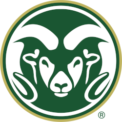
Colorado State Rams
A white and green ram's head inside a green and gold trim circle. Another change to a new shade of green and gold.
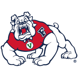
Fresno State Bulldogs
In December 2019, Fresno State changed to a deeper red while maintaining the classic navy for the two bold contrasting colors. Barking Bulldog wearing a red shirt with the letter "F" in blue with white…
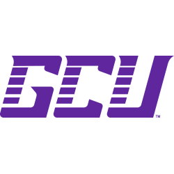
Grand Canyon Antelopes
Initials "GCU" in purple with speed lines through the letters. Called the speed GCU logo.
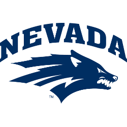
Nevada Wolf Pack
An electric looking wolf attacking in blue with a wordmark "NEVADA" above in blue.
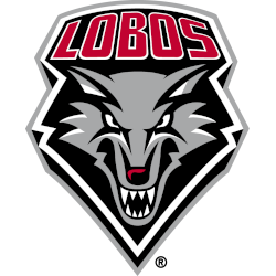
New Mexico Lobos
A front-facing wolf's head in silver, black, and red with a wordmark "LOBOS" above in red, all encased within a black, white, and silver shield. Removed the bevels from the wordmark "LOBOS," and rounded them…
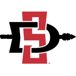
San Diego State Aztecs
Scarlet letter "S" interlocked with a black letter "D" and black spear going through the middle of the letter "D."
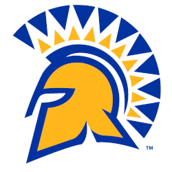
San Jose State Spartans
A blue, white, and yellow side view of a Spartans’ helmet. In September 2018, SJSU merged the university spirit mark and the Athletics Spartan helmet.

Utah State Aggies
The letter "U" in blue and grey with the word "State" in the broken letter "U" in blue with grey trim. Changed the color Pewter Grey to Silver.
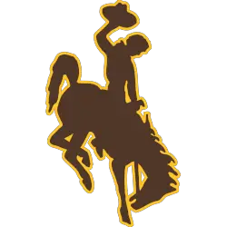
Wyoming Cowboys
A silhouette of a cowboy riding a bucking bronco in brown with a gold outline. Thickening the gold outline and slightly turning the logo counterclockwise about 5 degrees.
Mountain West Conference Logo History
The early Mountain West Conference primary logo focused on clean structure and regional identity. Because the conference was newly formed, clarity mattered. Designers emphasized balance and bold lettering. As a result, Mountain West Conference teams shared a unified look. This first phase of the Mountain West Conference logo history established a foundation that supported recognition across schedules, broadcasts, and official materials.
Design Refinements Over Time
As the conference grew, the Mountain West Conference primary logo received measured updates. Therefore, spacing, color balance, and sharpness improved. These refinements helped the logo adapt to modern media. Still, the core identity remained familiar. This stage of the Mountain West Conference logo history ensured that Mountain West Conference teams stayed visually connected despite branding updates.
Consistency Across Conference Teams
Consistency has always guided the Mountain West Conference primary logo. Because of this, Mountain West Conference teams use the logo without conflicting variations. The design works across uniforms, courts, and digital graphics. As a result, the Mountain West Conference logo history shows a clear commitment to league-wide branding rather than individual customization at the conference level.
Modern Primary Logo Usage
Today, the Mountain West Conference primary logo appears across official platforms, championship branding, and media coverage. Meanwhile, the design supports high-resolution digital use. As a result, the Mountain West Conference logo history remains current while respecting tradition. For official conference background, visit Mountain West Conference Wikipedia. You can also visit the Mountain West Conference alternate logo page to compare secondary designs.