Baylor University simplified and streamlined its athletic logos and uniforms prior to the 2019-20 school year.
The school worked with Nike to create, among other things, a unified green and gold color palette. Prior to this season, the university’s various athletic teams could be seen in five different shades of green and three different golds. There were also over 20 different combinations and variations of the Baylor logo and interlocking BU.

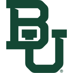
[/media-credit] Baylor Bears Primary Logo 2020 - Present
“This reveal is the culmination of a nearly 18-month process with Nike to research, review, and refine our existing brand,” said Baylor Vice President and Director of Intercollegiate Athletics Mack Rhoades in a press release. “The perspective and care with which Nike approached this project is invaluable, and we are beyond excited to carry forward this unified identity.”
The rebranding, which was called “Baylor United,” extended to new lamppost banners, McLane Stadium turf, mascot outfits, and more. The interlocking BU remains the primary logo, and the school hopes that using it consistently among all sports will help the school expand its reach and brand awareness.
The interlocking BU began appearing on Baylor uniforms in the 1950s and showed up on the football helmets a decade later. It became the primary athletic logo in 2005; and now, the university is using that mark for non-athletic endeavors as well.
“As I traveled outside of Waco, I quickly learned that our existing institutional logo did not have significant brand recognition outside of the Baylor family. In fact, our mark was indistinguishable among many other colleges and universities that also used historic buildings or landmarks with establishment dates as their logos,” Baylor President Dr. Linda Livingstone wrote in an email to students. “Only one university, however, owns the distinct interlocking BU – That’s Baylor University.”
The school also did away with nine alternate logos (ranging from different-colored interlocking BUs to a bear paw, to a larger depiction of a bear with BAYLOR written below) and chose one bear head – also in the same green and gold colors – to serve as one official alternate logo.

Baylor Bears Primary Logo 1969 - 1996
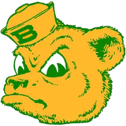
The Bear logo evolved from a 1950s logo known as Sailor Bear, which was an angry-looking cartoon bear wearing a sailor hat with a B on it. A more realistic bear logo followed from 1969 until 1997. Prior to the millennium, a near cartoon bear was designed; due to its bright green color, it was not-so-affectionally known as “Swamp Bear” and “Radioactive Bear.” After only three years, Baylor’s Student Congress voted to recommend a change, which took place five years later. Brown Bear was the logo used from 2005 until 2019 when the new-look bear with the green and gold colors debuted. This is the first bear since Sailor Bear to have the school’s traditional green and gold color scheme.
See the Baylor Bears logo history.
Sports Logo History is a community of sports logo enthusiast who enjoys the history of each team’s logo history. Sports Logo History has primary logos, alternate logos, wordmark logos or concept logos from the NFL, NBA, MLB, MLS, NHL, Premier League, WNBA, CFL, NCAA, ABA, USFL, AAF, and XFL.
Our partner site is Sports Team History takes a look at the history of each and every professional sports team.

