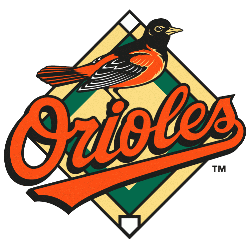
In 1998 the logos only changes were to the oriole bird on top of the scripted “Orioles.” A redesign of the oriole gives it more features and definition, still in orange, white and black.
In 1998 the logos only changes were to the oriole bird on top of the scripted “Orioles.” A redesign of the oriole gives it more features and definition, still in orange, white and black.
