The Arizona Diamondbacks have been in existence since 1998 as an expansion team along with Tampa Bay Rays who were formerly known then as the Tampa Bay Devil Rays. The Diamondbacks have had the fortune of playing in a World Series and winning it all in 2001. As a recent expansion team winning in 2001 is quite an accomplishment, only the Miami Marlins as a recent expansion team has won a world series, besides the Dbacks.

All of the Arizona Diamondbacks logo history
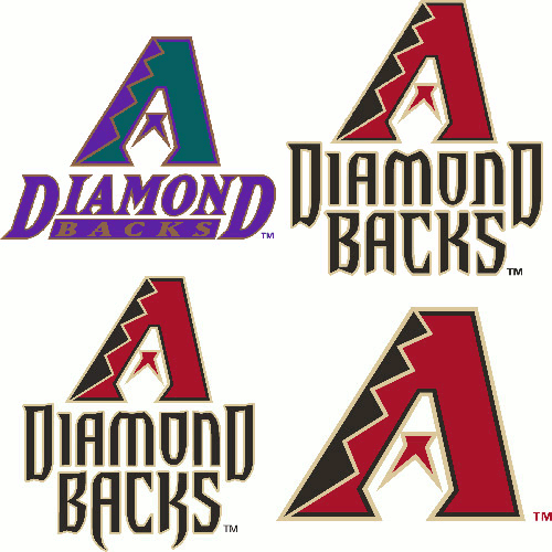
Examining the logo history of the Diamondbacks reveals that they have consistently used a snake-designed letter “A” with a snake tongue in the center. From 1998 to the present, the logo has changed to the fonts in the two wordmarks and the colors.
The Diamondback’s featured primary logo in 1998 was with the original colors of purple, black, teal, and copper. The logo is a visually appealing representation of the heart of the desert community. The dominant color of teal was attractive until they changed to the Sedona Red dominance.
In 2007, the logo shifted and changed colors to a brilliant Sedona Red. The snake-designed letter “A” did not change only the color layout. They made a significant change to the fonts of the wordmark “Diamondback” by using a custom-styled font. The bold color change to the Sedona Red makes the logo pop a little better, nice improvement.
Only a year later, in 2008, the Diamondbacks made another subtle change to the logo by reverting to the original fonts for the wordmark. The new custom fonts for the wordmark “Diamondbacks” feature snake-fang-like letters for both the letters “A” and “K.” This adds a nice touch of cuteness to the logo.
In 2012, the Diamondbacks adopted their current primary logo. The change was to remove the wordmark “Diamondbacks” from the logo. Keeping the stoic snake in the shape of the letter “A.” The logo is now simpler and less busy without the wordmark.
The Diamondbacks' identity is established; the snake-like letter “A” is highly recognizable, simple, and bold. When a logo can stand alone without any accompanying text, it is strong and timeless. See the Diamondback logo image with all four primary logos.
The $17 Million Caitlin Clark Effect: How One Rookie Changed the WNBA Forever
Visit Our YouTube Channel
