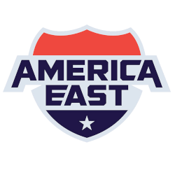
The America east conference logo and its full collection of America east wordmark logo designs highlight how America east teams express identity through clean typography and consistent branding. This page brings those wordmark styles together, showing how each school developed its look while staying aligned with conference standards. Every design reflects a commitment to clarity, recognition, and strong visual presence.
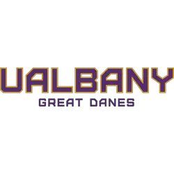
Albany Great Danes
A wordmark "UALBANY" in purple with gold trim above "GREAT DANES" in purple.
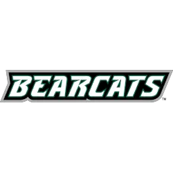
Binghamton Bearcats
Italicized wordmark "BEARCATS" wordmark in white with dark green trim on a black background and grey outline.
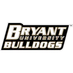
Bryant Bulldogs
A wordmark "BRYANT" in white with gold trim and "UNIVERSITY" in gold with white trim and "BULLDOGS" in white with gold trim on a black background.
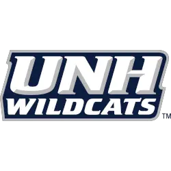
New Hampshire Wildcats
Initials "UNH" above a wordmark "WILDCATS" in white with grey highlights on a blue with grey outline background.
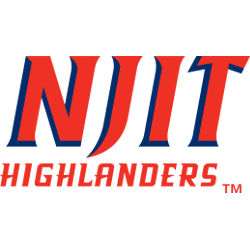
NJIT Highlanders
Initials "NJIT" in red and blue and a wordmark "HIGHLANDERS" in red.
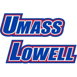
UMass Lowell River Hawks
A double-lined wordmark "UMASS LOWELL" in blue with white trim and a red outline on a blue background.
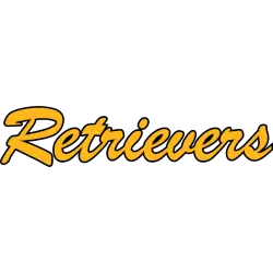
UMBC Retrievers
A scripted wordmark "Retrievers" in the brush script font in gold with black trim.

Vermont Catamounts
A slanted wordmark "VERMONT" in black on a gold background and a scripted wordmark "Catamounts" in white on a green background with gold trim.
A new shade of gold.
College Sports Fan Products


America East Conference Logo History
The America east conference logo inspired many of the wordmark styles used across the league, helping America east teams maintain a unified but distinctive visual identity. Each America east wordmark logo focuses on readable lettering, sharp lines, and modern spacing that stands out on digital media and merchandise. These consistent elements support strong brand visibility for schools throughout the conference. To learn more about individual programs, visit the official America East Wikipedia page.
Across the league, each America east wordmark logo works alongside its school’s primary symbol, providing a versatile option for uniforms, broadcasts, and promotional materials. While the america east conference logo remains the central identifier, the wordmark versions give teams added flexibility for marketing and fan engagement. You can view the related designs by visiting our internal America East Primary Logo page.
The evolution of every America east wordmark logo shows how typography supports competitive branding. Updated fonts, spacing, and color choices allow America east teams to stay modern without losing tradition. Together, these marks strengthen the conference’s overall identity and reinforce the visual unity fans recognize across the America East landscape.


