
Alabama Crimson Tide
A red letter "A" in an italic font. Former alternate logo moved in 2018.
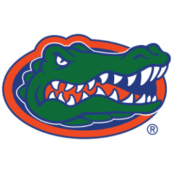
Florida Gators
A gator's head in the middle of an orange and blue oval. Darker orange and blue from the previous logo.

Georgia Bulldogs
A black letter "G" in a red oval surrounding the letter "G." Changed the shade of red to Bulldog Red for all of their logos and wordmarks.

Kentucky Wildcats
A royal blue with white trim interlocking letters "UK." A new version of the interlocking letters.


Mississippi State Bulldogs
A white banner with an arched wordmark "STATE" in maroon in front of a block letter "M" in maroon with an outline in grey. A new shade of maroon.

Missouri Tigers
A tiger's head on a black with gold trim oval-shaped. The shade of gold was changed again.

Oklahoma Sooners
A slight streamlining alteration to the red interlocking initials "OU" mark to improve its symmetry. The shade of Crimson was slightly changed.

South Carolina Gamecocks
Garnet and black rooster attacking inside a block black with the garnet trim letter "C." Rooster of the domestic chicken trained for fighting. This version with the Garnet outline on the C is white/light backgrounds…

Tennessee Volunteers
Orange letter "T." The letter "T" represent the state of Tennessee. Designed by Nike. The tallest of the three Tennessee logos.

Texas A&M Aggies
The state of Texas is in maroon with white and maroon trim with initials "ATM." The large letter "T" in the middle is in white with a maroon bevel and letters "AM" on either side…

Texas Longhorns
Front view of a burnt orange long-horned bull head. Another shade of Burnt Orange changed.

Vanderbilt Commodores
A bold letter "V" with curved serifs in gold with black trim. The gradient was removed.
Southeastern Conference Logo History
The Southeastern Conference logo serves as the central symbol of the SEC’s identity. Throughout the SEC logo history, updates focused on clarity, balance, and modern appeal. Each redesign maintained tradition while allowing SEC teams logos to remain visually unified across all sports and media platforms.
As the conference expanded, the Southeastern Conference logo adapted to represent a broader athletic footprint. However, consistency remained a priority. The official SEC logo history reflects careful refinements rather than drastic changes, ensuring long-term recognition alongside evolving SEC teams logos. Learn more about the conference background here.
This archive presents every Southeastern Conference logo used from inception to the present day. Together, these designs highlight stability and growth. To explore variations used alongside the primary mark, visit the internal Southeastern Conference Alternate Logo page for additional visual context.
College Sports Fan Products