
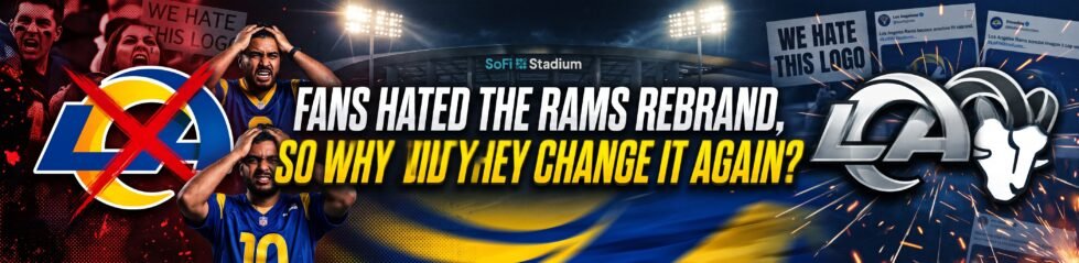
Sports fans have this strange, but funny habit of blaming new branding, like the Rams Rebrand, when results start going wrong.
In soccer, Juventus fans made their feelings clear after the club’s controversial 2017 crest redesign, while Chicago Fire fans have also had plenty to say about changes to their identity. NFL fans are no different.
When the Los Angeles Rams unveiled their new look in 2020, part of the Rams Rebrand, fans were quick to pick apart the gradient coloring, modern styling and just about every design decision attached to it.
Some felt the club had moved too far away from its traditional identity, while others simply weren’t convinced by the new LA monogram. The funny thing? The Rams won the Super Bowl less than two years later.
So, perhaps a new logo wasn’t quite the problem some fans thought it was. And yet, in April 2026, the Rams went back to the drawing board with another brand refresh, making changes to the very identity that had attracted so much criticism in the first place.
It raises an interesting question. Do fans really care that much about a team’s logo, or does their opinion depend on what’s happening on the field?
When things are going well, fans are more interested in standout performances, playoff chances and how their team is shaping up across the NFL depth charts. But when results turn sour, the conversation can quickly shift. Suddenly, the badge, the kit and even the club’s social media graphics become fair game.
And yet, the Rams’ 2026 refresh is still revealing. It suggests that even a Super Bowl can’t fully erase a difficult first impression.
Why Did The Rams Change Their Logo In 2026?

The Rams didn’t launch a full rebrand in 2026. They refined the identity they introduced in 2020.
The most visible change was the removal of the gradient from the “LA” monogram, which was replaced with a solid finish. The club said that change was influenced by fan and partner feedback, while the Ram-head logo was made bolder and more aggressive, with a sharper horn.
The uniforms received a similar clean-up. Gradient numbers and pant striping were removed, the chest branding was simplified, and the full modern horn motif returned to the sleeves. The Rams also retired the “Bone” off-white shade in favor of standard white, while retaining Royal and Sol as the franchise’s core colors.
This wasn’t a new era. It was an admission.
After six years of feedback, the Rams looked at the parts of the 2020 identity that hadn’t aged well and effectively said: fair enough, let’s clean this up. The club didn’t abandon the modern identity, but it softened the most polarizing elements and leaned back toward clarity, toughness and the franchise’s visual roots.
That’s a much stronger story than pretending the gold color represents some grand new vision. The 2026 update is the Rams acknowledging that a logo has to work beyond launch day.
Did The Rams Actually Have A Rebrand Problem?

Not really. They had a fan-perception problem. The 2020 rebrand wasn’t followed by failure. The Rams reached Super Bowl LVI and won it in February 2022, less than two years after introducing the new identity.
They also made the playoffs seven times in their first decade back in Los Angeles, with two Super Bowl appearances and one championship. Most clubs would take that return on investment immediately.
The contrast with Juventus is useful here. Juventus introduced its minimalist 2017 crest amid considerable backlash, then spent much of the following period drifting away from the European elite. The Rams introduced a divisive badge and promptly lifted the Lombardi Trophy.
That doesn’t mean the Rams’ original design was good because they won. It means winning changed the terms of the argument.
A successful team gives a controversial logo time to become familiar. It gives fans reasons to associate the mark with parades, playoff football and championship memories. A struggling team gives critics another reason to say the club has lost its way.
The Rams’ issue was never that the rebrand prevented them from winning. It was that the design didn’t earn affection quickly enough to make people stop noticing it.
There’s a temptation to treat a Super Bowl as the ultimate answer to every criticism. The Rams won one, so surely the badge must have been fine all along. Except that isn’t how design works.
A championship can make a logo familiar. It can make it part of the images fans replay: Stafford finding Cooper Kupp, Aaron Donald collapsing a pocket, confetti falling in Inglewood. But it doesn’t necessarily make the design itself feel loved.
There’s a difference between accepting a logo and forming an emotional attachment to it.
Is There Actually A Secret To Logo Longevity?
Forget the Rams for a second. Forget Juventus. Forget whether a redesign is “modern” or “classic.” The secret to logo longevity is memory.
The Green Bay Packers’ “G” is simple, but it’s iconic because it’s been attached to decades of winning. The Dallas Cowboys’ star isn’t beloved because it’s a masterpiece of contemporary design; it’s beloved because it represents one of the NFL’s most successful franchises.
The Denver Broncos’ horse logo was initially divisive, but John Elway’s championships helped turn it into part of the team’s identity.
Sports fans rarely fall in love with a logo on launch day. They fall in love with what happens while it’s being worn.
That’s why the Rams’ 2026 refresh is interesting. It doesn’t prove the 2020 rebrand was a failure. It proves that even success can’t instantly manufacture affection.
A Super Bowl gave the Rams credibility; it didn’t automatically give the “LA” monogram the emotional history that older marks had accumulated over generations.
The Bigger Point
The Rams didn’t need to change their logo to win a Super Bowl. They won one anyway. But the 2026 update shows the difference between a logo that’s tolerated and one that’s loved. Winning can buy a rebrand time. It can’t guarantee that fans will ever feel emotionally attached to it.
The best logos become part of a team’s story because fans associate them with moments: a game-winning drive, a playoff upset, a championship parade.
The Rams’ refreshed identity may eventually earn that status. Until then, it remains a reminder that design is only half the battle.
The other half is what happens on the field.