The Racing Louisville FC logo history showcases the team’s artistic and elegant branding in the NWSL. Each Racing Louisville FC Wordmark logo and Racing Louisville FC logo PNG design highlights the club’s connection to Louisville’s culture and its growing presence in women’s soccer.

Racing Louisville FC
Four fleur-de-lis in black in the center of a circle in purple with a white and black trim and an encircled wordmark “RACING LOUISVILLE FOOTBALL CLUB” in black.
Racing Louisville FC
2021 - Present
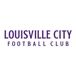
A double-lined wordmark "LOUISVILLE CITY FOOTBALL CLUB" in purple.
Font: Custom
Racing Louisville FC
2021 - Present
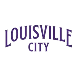
An arched double-lined wordmark "LOUISVILLE CITY" in purple.
Font: Custom
Racing Louisville FC Logo History
The Racing Louisville FC Wordmark logo blends modern typography with graceful design, representing unity and sophistication. Its purple tones connect to the city’s creative roots, making it one of the most distinctive designs in the NWSL. Over time, the Racing Louisville FC logo history has evolved to express confidence and individuality. Fans can learn more about the team on the Racing Louisville FC Wikipedia page.
Each version of the Racing Louisville FC Wordmark logo maintains balance between artistic flair and readability. The Racing Louisville FC logo PNG versions are designed for adaptability across digital and print platforms, ensuring brand consistency. These updates reflect the club’s dedication to innovation and visual harmony.
Through the Racing Louisville FC logo history, the Racing Louisville FC Wordmark logo has become a strong emblem of identity and pride. Its evolution represents growth, creativity, and commitment to excellence. For related visuals, visit the Racing Louisville FC Primary Logo page on our site.
Soccer Sports Fan Products