Regarding the intersection of sports, history, and design, few stories are as riveting as the visual evolution of the New York Knicks logo. The Knicks, with their deep-rooted history, offer a fascinating journey through the decades via their changing logo designs. Let’s take a stroll down the memory lane of this iconic logo.
The Birth of a Legend: 1946-1964
 The New York Knicks' inaugural logo paints a vivid picture of the city's origins. With a nod to the Dutch settlers, known as "Knickerbockers," the emblem showcased a basketball player named Father Knickerbocker. Cloaked in clothes reminiscent of the early settlers, the emblem was tinged with humor, courtesy of the cartoonist Willard Mullin. His whimsical touch transported fans to an era when New Yorkers sported breeches or pantaloons, a nod to the team's nickname, "Nix."
Stepping into Modernity: 1965-1979
The 1965 redesign ushered in a contemporary era. Bud Freeman, from the advertising giant J. C. Penney, created a basketball-centric logo infused with vibrant orange letters spelling "KNICKS." With subtle shadowing, the logo boasted a three-dimensional touch, a departure from its more caricatured predecessor.
Subtle Hues of Change: 1980-1989
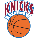
 As the '80s dawned, the Knicks' logo experienced a series of color shifts. Starting in 1980, a lighter basketball hue paired with burgundy letters offered a fresh look. By 1984, pastel shades dominated, granting the logo a softer yet still recognizable appearance.
From Subtlety to Clarity: 1990-1995
The 90s witnessed the logo's metamorphosis from its misty, fog-imbued aura to a more precise and bolder representation. Embracing an orange basketball to match the vibrant "KNICKS" wordmark, the blue outlines added a touch of sophistication. It was succeeded by a dynamic design in 1992, where Michael Doret introduced a triangle backdrop, further deepening the three-dimensional essence of the logo.
Homage to Heritage: 1996-2011
 Returning to their roots, the 1996 design reincorporated the "NEW YORK" wordmark, connecting the past with the present. While the essence remained, minute color adjustments kept the logo fresh and relevant.
Embracing the Present: 2012-Now
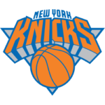
The present logo, though distinct from its first iteration, still bears the mark of its rich legacy. Simplified shadows and adjusted colors present a modern interpretation, yet the basketball at its core ensures continuity. The return to a blue-centric color palette has been embraced by fans, resonating with New York City's official hues.
Notably, the Knicks’ logo's latest iteration is drenched in city pride. The colors are not mere shades; they are the city’s spirit embodied. The bright orange radiates the city's vibrancy, white letters underscore clarity, and blue signifies trust and stability.
Yet, while the logo dazzles in its urban energy, some critics argue its flair borders on the flamboyant, likening it to a superhero's logo or a detergent label. Such critiques, however, don't deter the die-hard Knicks enthusiasts. For them, this logo encapsulates the heart of a team rooted in a sprawling metropolis known for its verve, grit, and ceaseless evolution.
For many fans, their dedication goes beyond just supporting the team during games. They actively check the FanDuel NBA Odds, placing their bets and predictions based on team performances, further intensifying their connection and engagement with the Knicks. The logo, thus, isn't just a visual representation; it's a symbol of unwavering faith and fervent passion that has stood the test of time.
Wrap Up
The New York Knicks' logo journey is more than a tale of changing graphics; it's a chronicle of the city's history, culture, and indefatigable spirit. Through shifts in design, the logo has remained a steadfast symbol of basketball's heart in the Big Apple. Today, as fans don their jerseys adorned with the modern logo, they wear not just a logo but a legacy.

