With batters staring down pitchers and the outfielders staring up to catch pop-up flies, baseball hats are a necessary utility in the sport. Today, baseball caps serve as more than just sun shields. Teams have been using them as effective branding tools, considering that it bears the team’s logo.
Logos are a vital aspect of MLB teams, giving fans and the audience a quick visual identifier that triggers them to think about the team. This is one of the main reasons and success behind merchandising. A cool MLB logo can be the difference between a $30 cap sale and a hard pass.
Major League Baseball has a total of 30 teams and some have been around for well over a century. MLB team logos have changed and evolved a great deal over the years. Some teams are even known to make logo tweaks almost every season.
In this article, we’ll highlight baseball teams with the best logos but that doesn't mean they will have the best MLB scores, so make sure you keep up with that too.
Los Angeles Dodgers
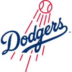
Los Angeles Dodgers Primary Logo 2012 - Present
The Dodgers is one of the teams with the longest history in MLB, painting an iconic image in the sport. Baseball is essentially more indebted to history than any other sport. The Dodgers are arguably the most recognizable to use royal blue, which is a strong look against the base white.
The tertiary access of the red-on jersey numbering really helps with portraying a bold appearance. The iconic interlocking of the letters “L” and “A” with a stark distinction in color helps put the Dodgers’ logo at the top of this list.
New York Yankees

New York Yankees Primary Logo 1968 - Present
The Yankees have a simple logo of a superimposed “NY” combination, but this is one of the most iconic logos in the MLB. As a matter of fact, the Yankee’s logo is the most recognizable of all logos in North American sports. That definitely has to count for something.
The team’s jersey is also iconic, featuring pinstripes and an arm patch logo with a splash of red in addition to the navy blue and white. Like the “LA” for the Los Angeles Dodgers, the “NY” for the Yankees cap is enough on its own.
Chicago Cubs
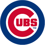
Chicago Cubs Primary Logo 1979 - Present
The Chicago Cubs did a great job at including their team’s name in a single-letter logo. This was only possible because the letter is part of the same word.
While the red and Cubbie blue combination might not be as unique as some would expect, the logo looks just as great and iconic. This logo receives some bonus points for the great devotion given to the blue color as the primary color, instead of white like most.
Milwaukee Brewers
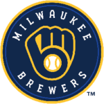
Milwaukee Brewers Primary Logo 2020 - Present
The Brewers’ logo ranks as being the most elite. For those who haven’t realized it yet, the logo is a combination of the letters “MB” in the shape of a baseball glove. This is by far the most iconic and creative logo in the history of the MLB.
The Milwaukee Brewers would rank higher for this logo had they been using it all the time. The most commonly used Brewers’ logo is the “M” atop a strand of wheat, which is a nod to the beer. This old logo has become part of the team’s culture and makes a reputation for the city that named it, but the glove logo is next level.
St Louis Cardinal
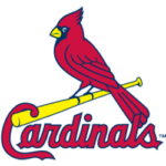
St. Louis Cardinals Primary Logo 1998 - Present
The white and red is a clean look, but unlike the Reds, the Cardinals have a yellow accent from the bat to foil the coloring. Besides the yellow distinction, the bat is simple and acts as a fun addition to the team’s jersey.
Most MLB teams rely solely on their names or cities for logos, but the Cardinals have added a few birds and a bat on their jerseys. The team’s cap lettering is also quite generic but memorable for the long history of the St. Louis franchise.
The Cardinal’s logo gives a strong look with a tad of fun creativity and great history – a complete package.
Detroit Tigers
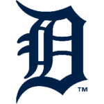
Detroit Tigers Primary Logo 2016 - Present
The Tiger’s logo is an Old English letter “D” which is simple yet elegant enough to rank on this list. Some would argue that the rest of the team’s look is fairly pedestrian. This is in part because there is nothing else iconic about the team’s jersey.
However, the orange and navy blue are just fine. The single letter “D” is one of the most iconic logos in the history of sports. It serves as a great aesthetic that highlights the history of one of the signature baseball franchises.
Baltimore Orioles
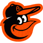
Baltimore Orioles Primary Logo 2019 - Present
The Orioles have reworked their logo a number of times over their half-century history. The best of all their logos is the cartoon smiling bird. The logo is considered the most fun and creative in the MLB. The black and orange is a stellar color combination.
What makes the logo more fun is the fact that the cartoon smiling bird is wearing a hat of its own – the standard cursive “O’s”. This way, Orioles fans get to enjoy the best of both worlds with this hat.
Oakland Athletics
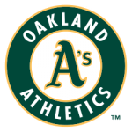
Oakland Athletics Primary Logo 1993 - Present
The Athletics’ logo ranks for the team’s elite color combination, one of the best in baseball and all professional sports. The gold and Kelly-green combinations pair well, and it does not matter what else the Athletics decide to do with their jerseys and hats.
The franchise’s hat is also great, with the nickname “A’s” strongly imprinted.
Kansas City Royals
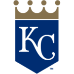
Kansas City Royals Primary Logo 2019 - Present
The white and blue trim of gold gives a clean and crisp look to the Kansas City Royals. The gold crown that adorns the arm patch is a genius way to integrate the name of the franchise.
The Royals boast a classic look that has earned its royal status as one of the most iconic looks in Major League Baseball. The “KC” lettering on the team’s hat might not be the best in the league, but the jersey logo makes up for it.
Toronto Blue Jays
 Sports Logo History
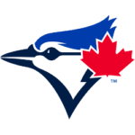
 Toronto Blue Jays Primary Logo 2020 - Present
The Blue Jays did a great job at paying tribute to their standing as Canada’s only MLB team with the maple leaf on their hat. The picture of a bird only makes it even better. The white, red, and blue combination looks great.
Wrap Up
Baseball logos are not created equal. Some of them look incredibly attractive. Others look like they were created in a hurry. The franchises highlighted above went to great lengths to create logos their fans, players, and corporate sponsors love.
___
Sports Logo History is a vibrant community of sports logo enthusiasts who share a deep appreciation for the captivating histories behind each team's logo. We take pleasure in exploring the evolution of primary logos, alternate logos, and wordmark logos from renowned leagues such as the NFL, NBA, MLB, MLS, NHL, Premier League, WNBA, CFL, NCAA, UFL, ABA, USFL, AAF, and XFL. Immerse yourself in the intricate details and stories behind these iconic symbols that represent the essence of each team.
In the enthralling realm of sports, the battle of logos among different leagues unfolds as a captivating and ongoing spectacle. Step into the world of Sports Logo History, where we showcase the relentless pursuit of distinction by leagues such as the NFL, NBA, MLB, Premier League, and countless others. Witness the captivating journey as each league strives to create logos that not only capture the essence of their sport but also resonate deeply with fans.
Immerse yourself in the comprehensive sports history provided by Sports Team History, our esteemed partner site, where you can discover the triumphs, challenges, and defining moments that have shaped the legacies of professional sports teams. Stay up to date with the latest sports news through Sports News History, a platform delivering 24/7 coverage of highlights, player interviews, and game analyses. Additionally, express your unwavering support for your favorite teams by exploring Sports Store History, the premier sports team marketplace offering a vast selection of jerseys, memorabilia, and collectibles. Join our community today and celebrate the rich history, iconic logos, and passion of sports.

