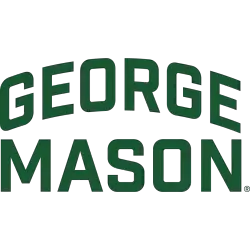
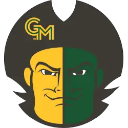
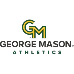
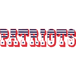
New England Patriots Alternate Logo
The Patriots have used an alternate logo way back to the Boston days. The tri-quarter hat with very patriotic lettering of the wordmark “PATRIOTS” has a great look. The alternate logo with the letters “NE” and the flying star from the primary logo is very creative as well. (adsbygoogle = window.adsbygoogle || []).push({}); Patriots Primary Logo Patriots Wordmark Logo Patriots …
Boston Patriots Primary Logo
For ten years the Boston Patriots were in existence they have some classic logos. The first being a tri-corner hat from the revolution era, is a simple but very effective logo. In 1961 the logo changed to Pat Patriot, as the minuteman hiking a football. Another classic logo from the AFL day. (adsbygoogle = window.adsbygoogle || []).push({}); Patriots Alternate Logo …
New England Patriots Primary Logo
The Patriots began their NFL career in 1960 as the Boston Patriots. A simplistic blue, tri-corner hat was their logo for only a year before the Patriots saw the other, intricate teams’ logos and decided to re-brand and add a Revolutionary War minuteman under the hat (which was changed to red). “Pat Patriot” was a red, white, and blue cartoon-like …