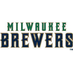
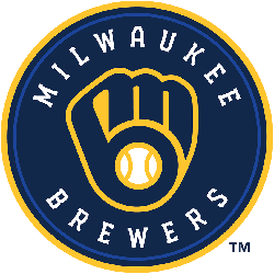
Milwaukee Brewers Primary Logo
The Brewers gave their new logo some modern flourishes, connecting the “m” and “b” that form the baseball glove, changing the color from royal blue to navy blue and putting two seams on a now-centered baseball to give it a more authentic look. Club president of baseball operations Rick Schlesinger said the intent was to stay true to the nature …
Milwaukee Brewers (Orioles) Primary Logo
Typical turn of the century logo for the Milwaukee Brewers. The blue wordmark “MILWAUKEE” in an arch was very common around the 1900s. (adsbygoogle = window.adsbygoogle || []).push({}); Brewers Team History amzn_assoc_placement = “adunit0”; amzn_assoc_tracking_id = “yorkshirete03-20”; amzn_assoc_ad_mode = “search”; amzn_assoc_ad_type = “smart”; amzn_assoc_marketplace = “amazon”; amzn_assoc_region = “US”; amzn_assoc_default_search_phrase = “Baltimore Orioles”; amzn_assoc_default_category = “All”; amzn_assoc_linkid = “61d965643f2f2df12014013a41bde1f7”; amzn_assoc_search_bar …