The Oregon Ducks logo history showcases the evolution and variety of symbols representing the University of Oregon’s athletic teams. The logos reflect changes in design trends and the team’s identity over the years. Early Logos (1974 – 1998) 1974 – 1993: The Classic Donald Duck The initial logo features a cartoonish Donald Duck character. This logo captures a sense of …
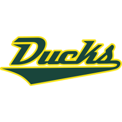
Oregon Ducks Wordmark Logo
Oregon Ducks 1999 – Present A green letter “O.” The letter “O” represents the state named Oregon. Ducks Primary LogoDucks Alternate LogoDucks School HistoryDucks Team MerchDucks Wordmark Logo The Oregon Ducks wordmark logo has been a staple of the University of Oregon’s athletics department since its introduction in 2002. The original design was created by Nike co-founder Phil Knight and …
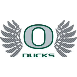
Oregon Ducks Alternate Logo
Oregon Ducks 1999 – Present A green letter “O.” The letter “O” represents the state named Oregon. Ducks Primary LogoDucks Wordmark LogoDucks School HistoryDucks Team MerchDucks Alternate Logo The Oregon Ducks’ alternate logo history is one that has been evolving since the school’s inception in 1876. The first logo was a simple yellow “O” with an orange beak and webbed …
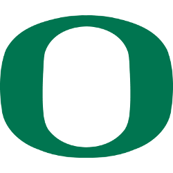
Oregon Ducks Primary Logo
Oregon Ducks 1999 – Present A green letter “O.” The letter “O” represents the state named Oregon. Ducks Alternate LogoDucks Wordmark LogoDucks School HistoryDucks Team MerchDucks Primary Logo The Oregon Ducks have had a long and storied history with their primary logo. The first iteration of the logo was created in 1947 by Walt Disney, who designed it for the …

Anaheim Ducks Wordmark Logo
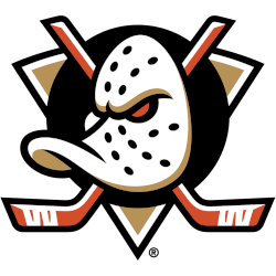
Anaheim Ducks 2025 – Present A duck’s goalie mask in white with black holes and gold highlights on a black oval has a single orange eye, the two orange with white highlights crossed hockey sticks with white tape, and the entire logo is placed on a gold triangle trimmed in white and black. It is the original Mighty Ducks design …
Anaheim Ducks Alternate Logo
Anaheim Ducks 2025 – Present A duck’s goalie mask in white with black holes and gold highlights on a black oval has a single orange eye, the two orange with white highlights crossed hockey sticks with white tape, and the entire logo is placed on a gold triangle trimmed in white and black. It is the original Mighty Ducks design …
Mighty Ducks of Anaheim Primary Logo
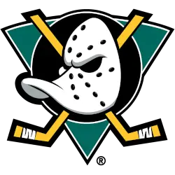
Mighty Ducks of Anaheim 2000 – 2007 A duck-billed goalie mask in white with black holes and silver highlight on a jade green with white and black trim triangle, a black with white trim circle, and two crossed hockey sticks in gold with thicker black trim. A thicker black outline around the hockey sticks and black trim added to the …
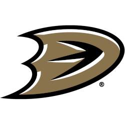
Anaheim Ducks Primary Logo
Anaheim Ducks 2025 – Present A duck’s goalie mask in white with black holes and gold highlights on a black oval has a single orange eye, the two orange with white highlights crossed hockey sticks with white tape, and the entire logo is placed on a gold triangle trimmed in white and black. It is the original Mighty Ducks design …