The Denver Broncos, a renowned National Football League (NFL) team, has a rich and storied history, reflected vividly in its logo. Like the team itself, the logo has evolved through the years, mirroring the club’s spirit, resilience, and ambition. This article aims to delve into the evolution of the Denver Broncos logo, providing insight into its significant transformations and the …

Infographic: Denver Broncos a Storied Logo History
Denver Broncos Primary Logo 1962 – 1969 It is no secret that the Denver Broncos have had a storied history ever since they started as a charter member of the AFL in 1960. They became associated with the NFL as part of the AFL-NFL merger in 1970. The Broncos have won over 10+ division championships in their history. After losing …
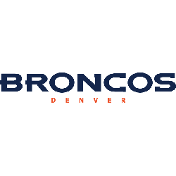
Denver Broncos Wordmark Logo
Denver Broncos 2002 – Present A profile of a white and navy blue highlighted horse’s head with a navy blue outline and an orange mane. The shade of orange was darkened and the navy blue was adjusted slightly as well. Designed by Nike Broncos Alternate LogoBroncos Primary LogoBroncos Team HistoryBroncos Team MerchBroncos Wordmark Logo The Denver Broncos have had a …
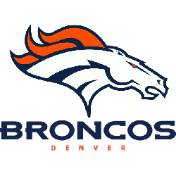
Denver Broncos Alternate Logo
Denver Broncos 2002 – Present A profile of a white and navy blue highlighted horse’s head with a navy blue outline and an orange mane. The shade of orange was darkened and the navy blue was adjusted slightly as well. Designed by Nike Broncos Primary LogoBroncos Wordmark LogoBroncos Team HistoryBroncos Team MerchBroncos Alternate Logo The Denver Broncos’ alternate logo history …
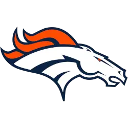
Denver Broncos Primary Logo
Denver Broncos 2002 – Present A profile of a white and navy blue highlighted horse’s head with a navy blue outline and an orange mane. The shade of orange was darkened and the navy blue was adjusted slightly as well. Designed by Nike Broncos Alternate LogoBroncos Wordmark LogoBroncos Team HistoryBroncos Team MerchBroncos Primary Logo The Denver Broncos have been around …